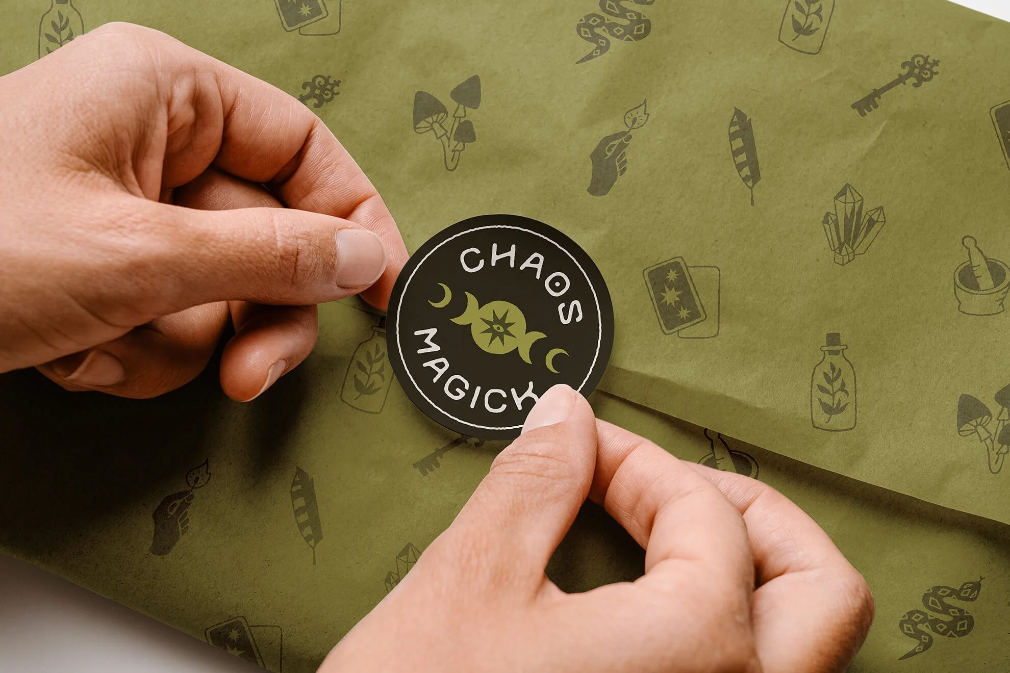
Building a Brand for a Community-Centered Witch Shop
Chaos Magick
Client
Chaos Magick
Industry
Retain
Services
Logo design
Strategy + Positioning
Branding
Iconography
Chaos Magick is a community-centered metaphysical shop for practicing witches, curious seekers, and spiritually minded individuals forging their own paths. Offering a thoughtfully curated selection of magick books, ritual tools, crystals, and resources, the shop encourages spiritual exploration, personal transformation, and meaningful connection.
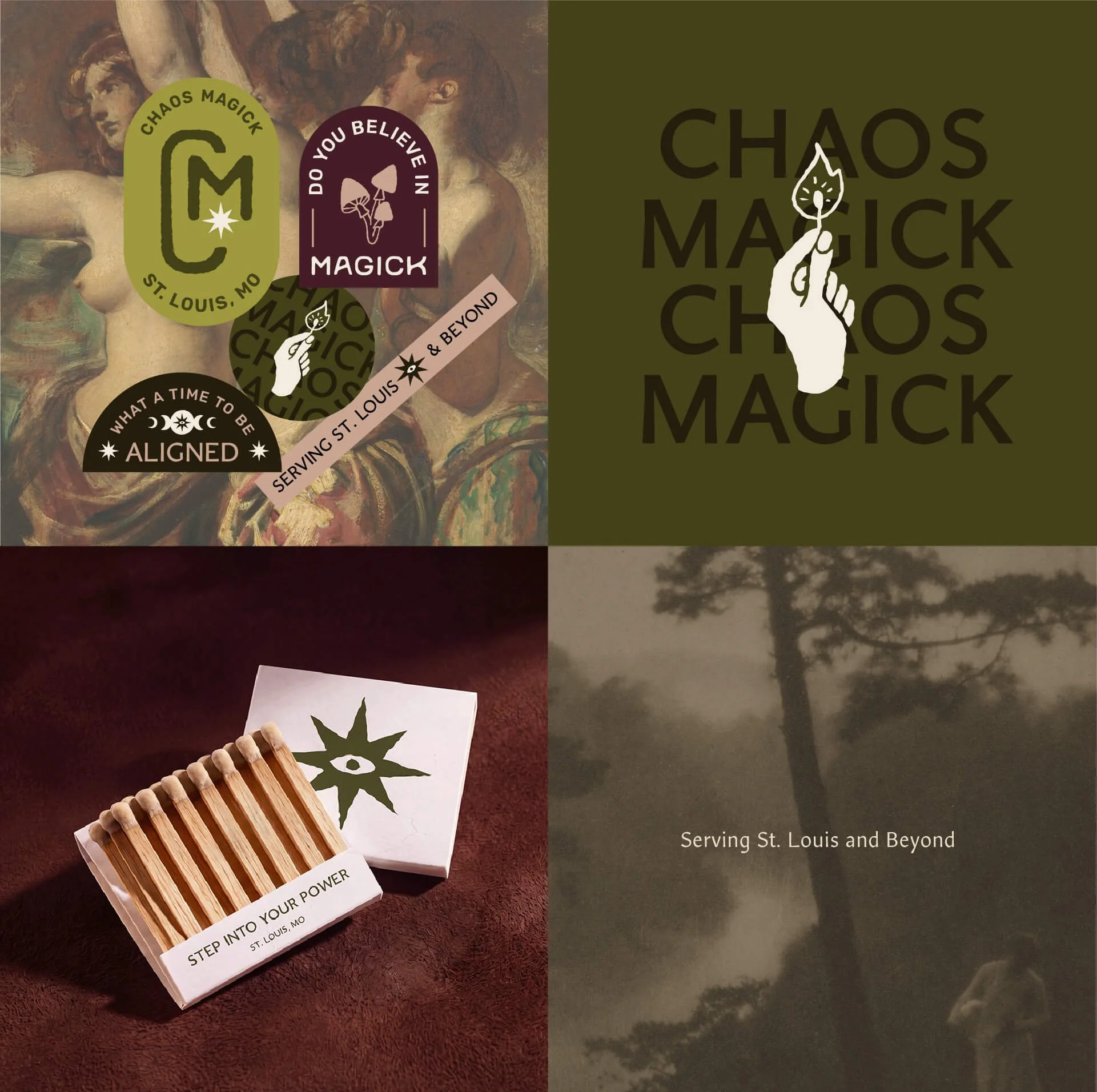
Founder Chrissy came to me with a vision for something different from the metaphysical shops already established in the St. Louis area. She wanted to create a space where knowledgeable guidance and carefully selected products went hand in hand with a genuine sense of community. Together, we developed a distinctive visual identity that captures the shop's witchy personality while establishing a more intentional, informed, and elevated presence in the market.
Challenge/Solution
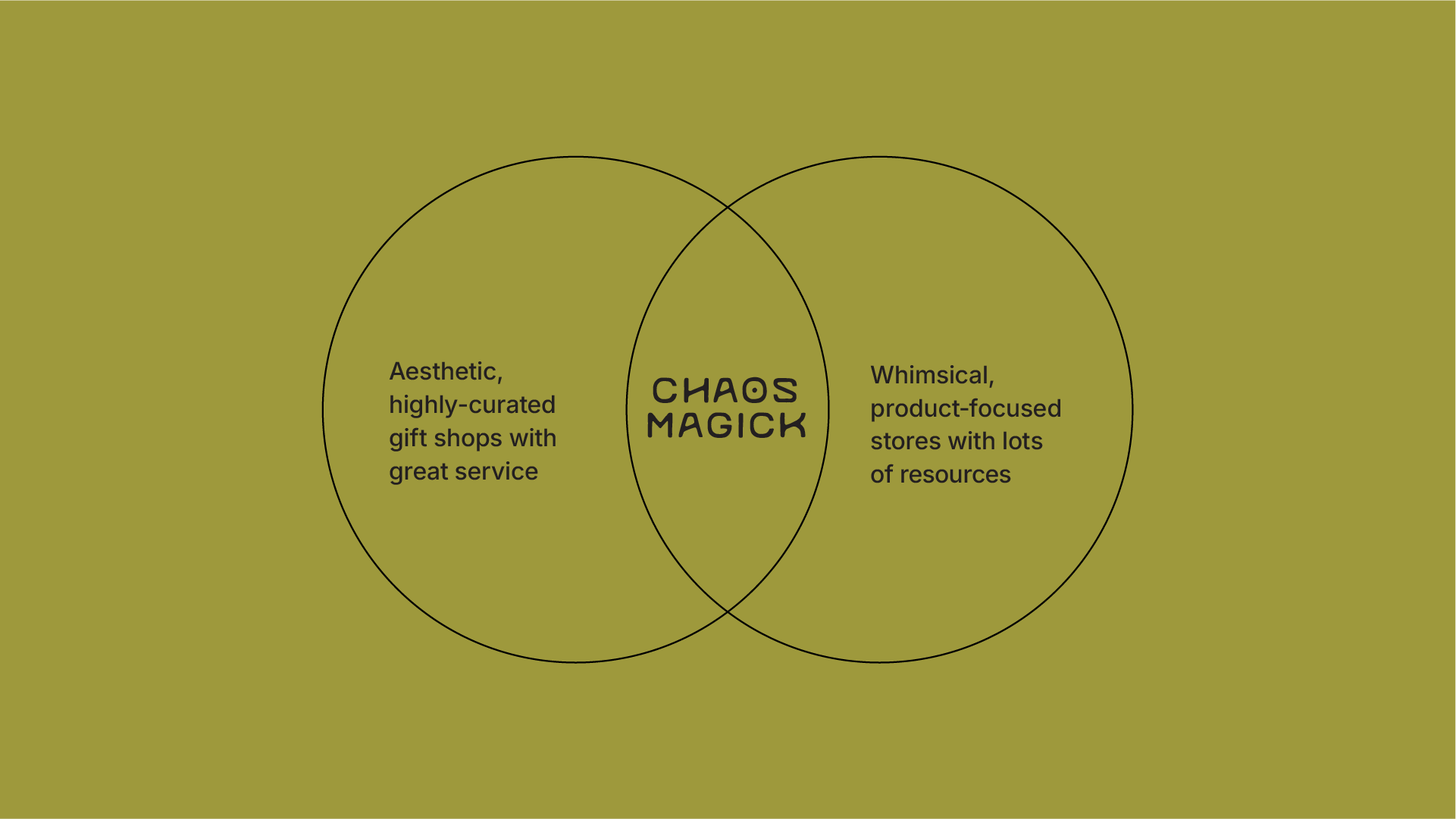
When Chrissy set out to open Chaos Magick, she saw an opportunity to fill a gap in the local metaphysical market. Through competitive research, we found that many shops leaned heavily in one of two directions: large product selections that often lacked curation, or beautifully designed boutiques with limited inventory and resources. Neither quite captured the experience Chrissy wanted to create.
Having experienced firsthand how intimidating the metaphysical community could sometimes feel when she was learning, Chrissy wanted to do things differently. Her vision was a space where people could find thoughtfully selected products, access knowledgeable guidance, and explore their own spiritual practices without judgment or gatekeeping.
Our goal was to position Chaos Magick at the intersection of boutique curation and genuine witchy personality. Through strategic positioning and a distinctive visual identity, we created a brand that communicates knowledge, individuality, and community while carving out its own space in a crowded local market!
Brand Discovery
Through our branding workshop and competitive research, we uncovered what would make Chaos Magick different: a commitment to thoughtful curation, informed exploration, and a community built on shared knowledge rather than gatekeeping.
At its core, Chaos Magick champions the freedom to forge your own spiritual path. There's no single right way to practice, no expectation to follow trends, and no judgment for being at the beginning of your journey. The shop exists to provide the resources, guidance, and community to help people discover what resonates with them.
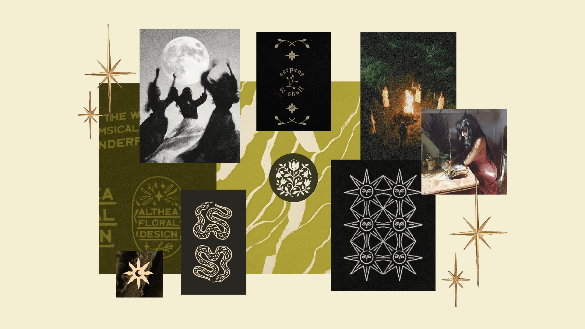
This strategy informed a visual identity that balances boutique sophistication with a distinctly witchy edge. Rather than leaning into the familiar aesthetics of the local market, we developed a visual language with its own personality, pairing a considered design system with custom iconography that gives the brand a recognizable and memorable character
“Before meeting with Chelsey I felt overwhelmed and intimidated—a business’ visual identity is so important, and for my brand, it’s a direct reflection of me as an individual. As this was a new concept, my expectations were very open-ended; I knew what I didn’t want, and I had a vision for the general vibe of the shop, but had very little direction for where the visual identity should go, and nothing physical or tangible yet to base that on. Chelsey’s approach was thoughtful, guided by a deep well of experience, comprehensive competitive research, and an uncanny ability to know just the questions to ask to pull my vision out of the ether.”
Logo Concepts
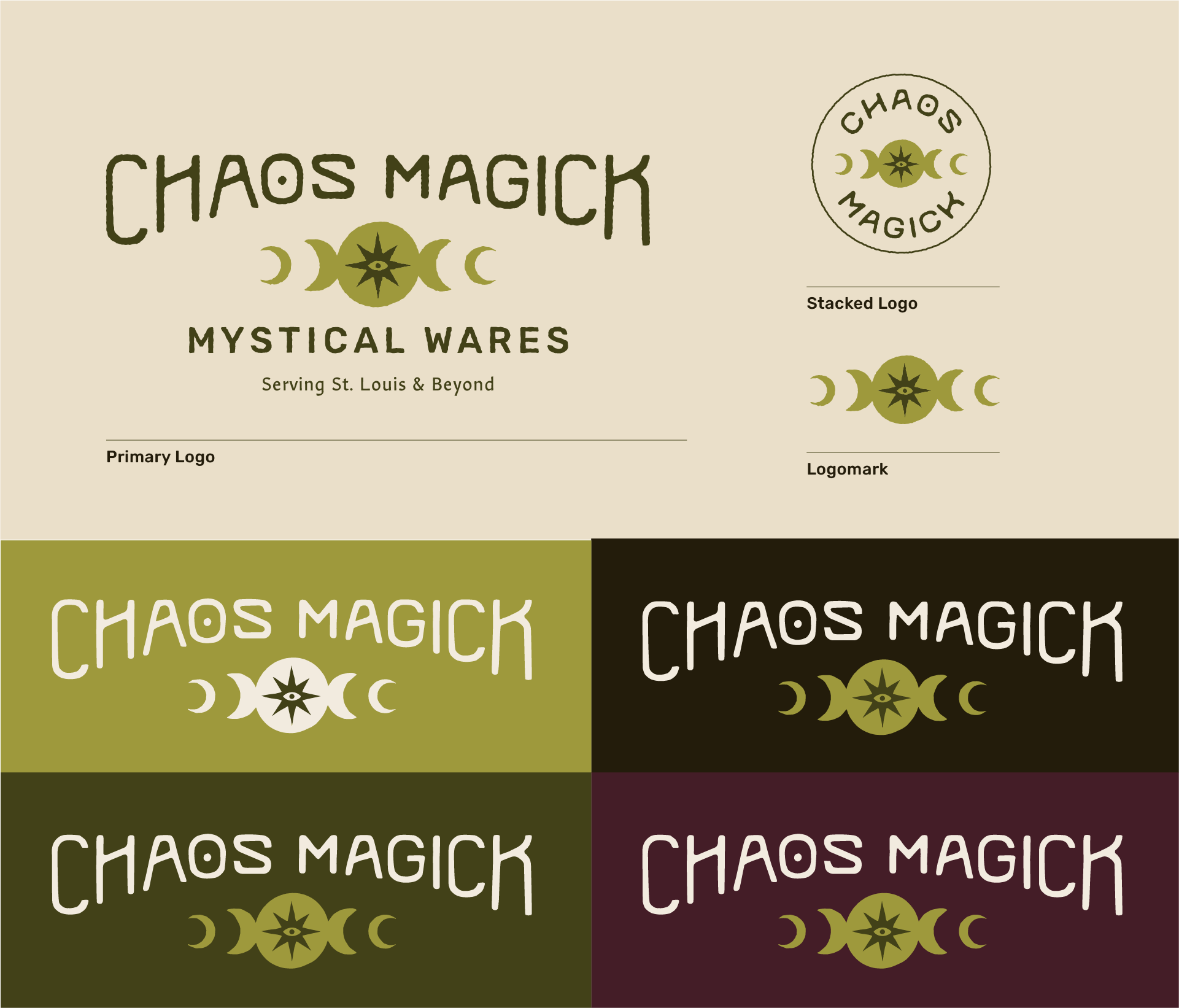
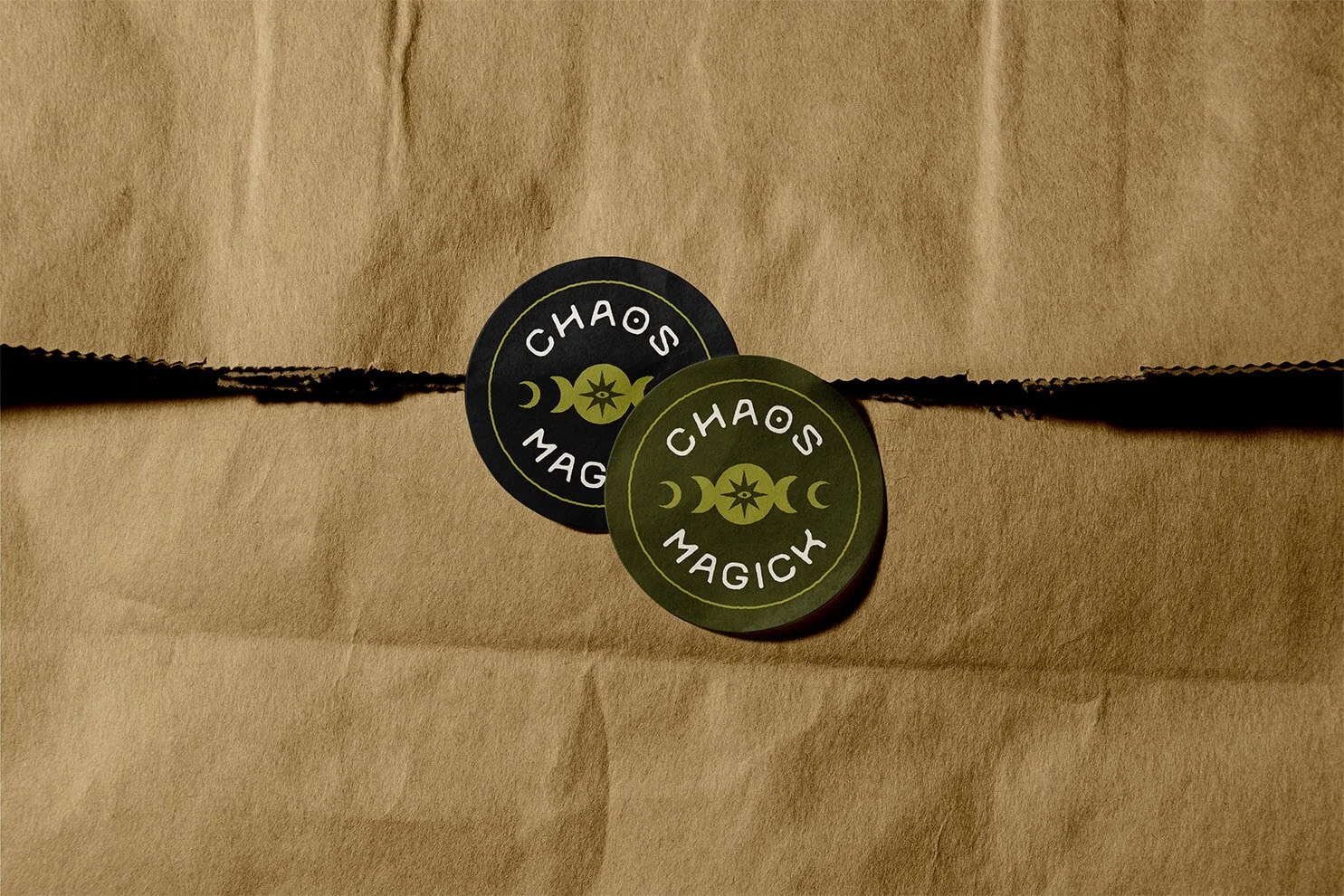
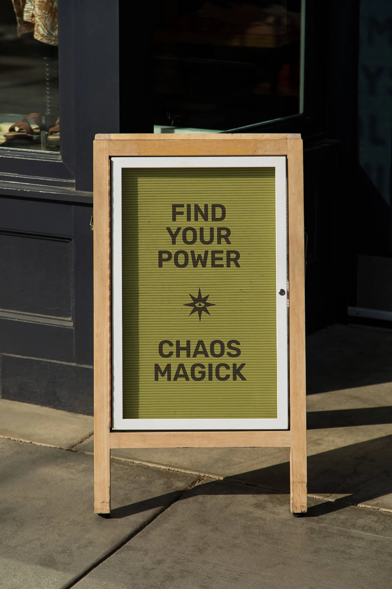
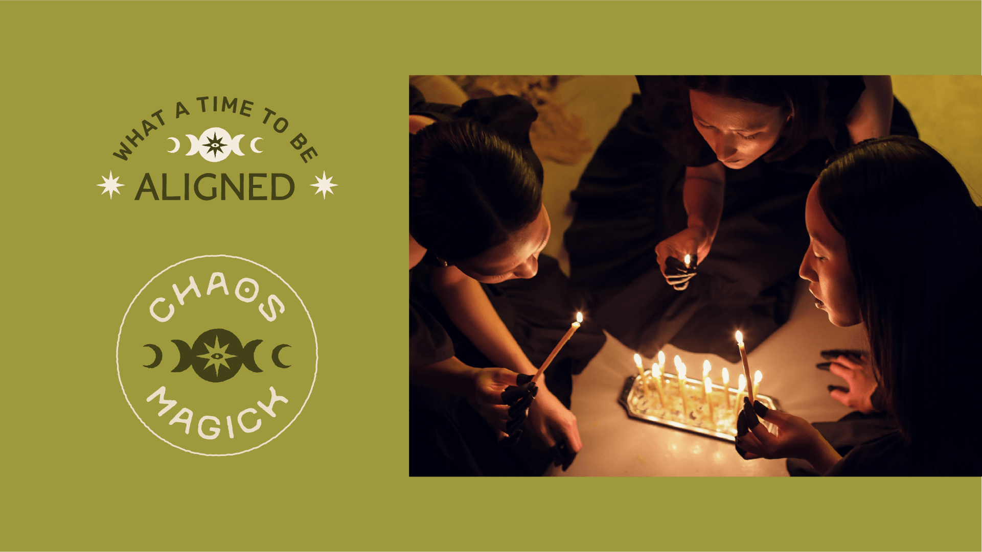
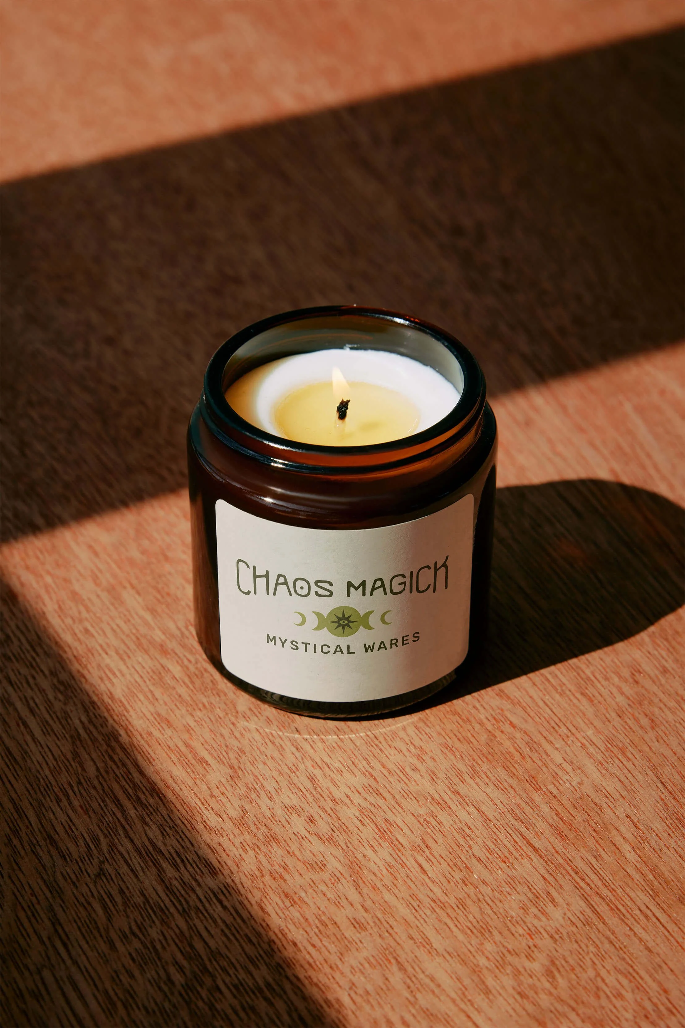
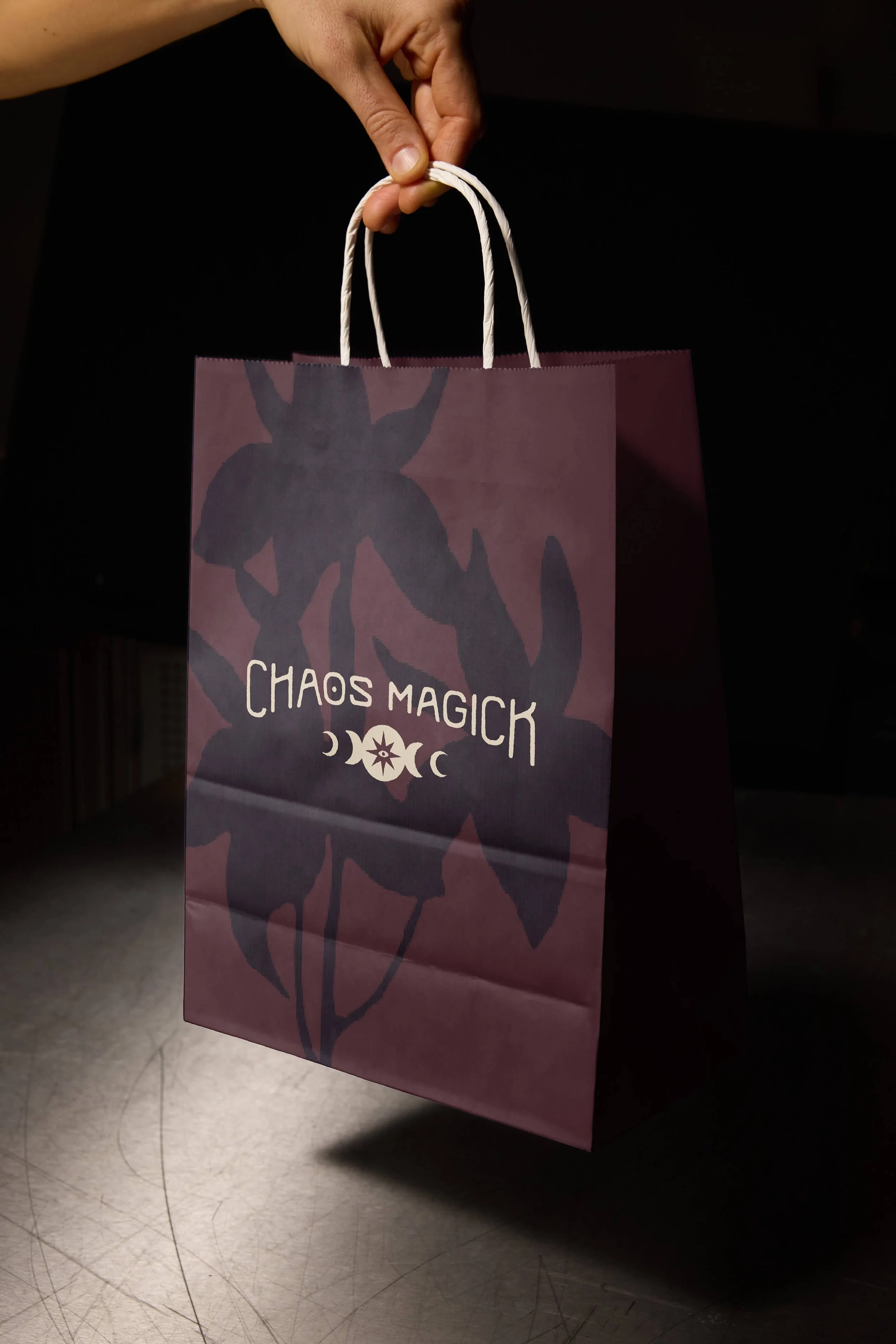
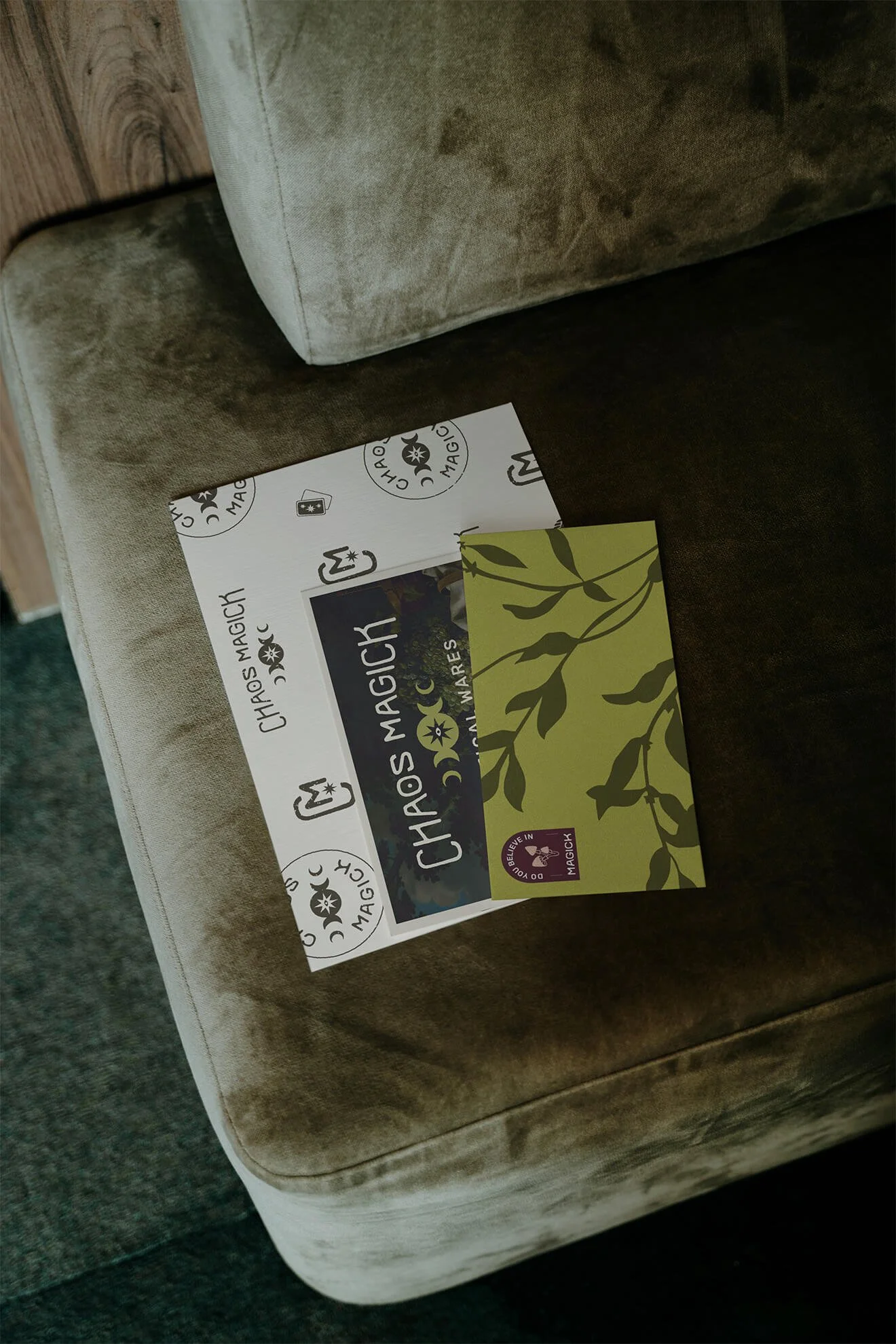
The Chaos Magick logo system brings together mystical symbolism and distinctive typography to create a mark that's both recognizable and full of personality. Thoughtful details and custom lettering give the identity a distinctly witchy feel while maintaining the polish and versatility needed to work across everything from storefront signage to product packaging.
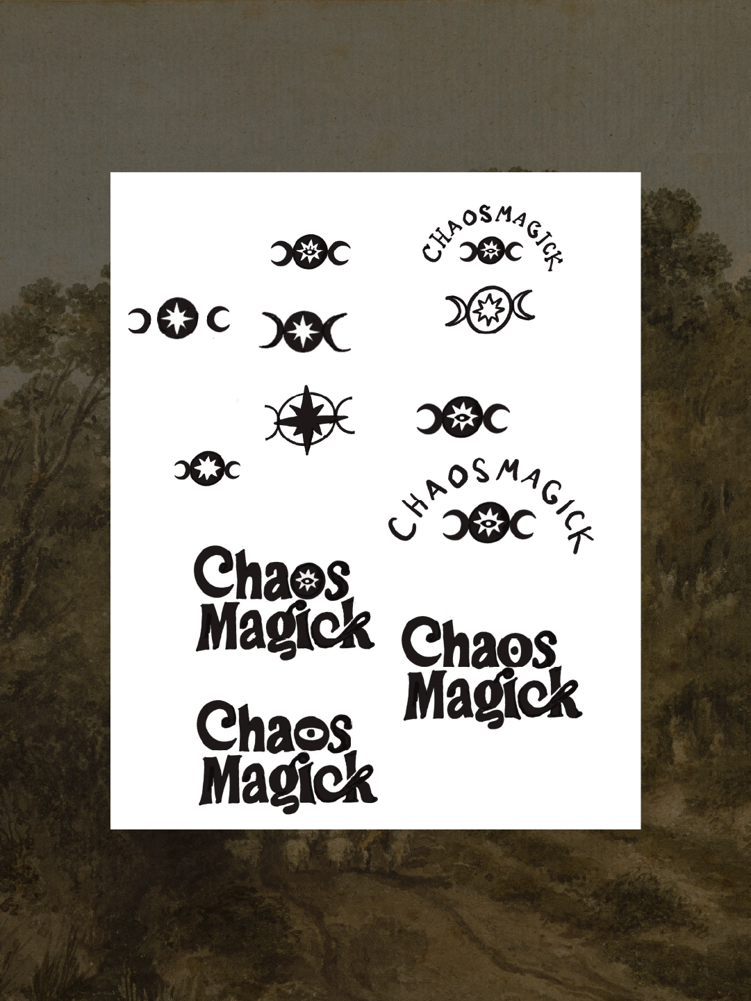
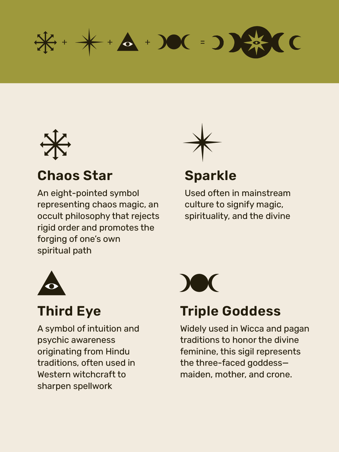
Symbolism played an important role in the logo design. The left image shows some early concept sketches, while the right breaks down the symbols that came together to create the final mark: the Chaos star, a sparkle, the Third Eye, and the Triple Goddess sigil.
Brand color palette & typography
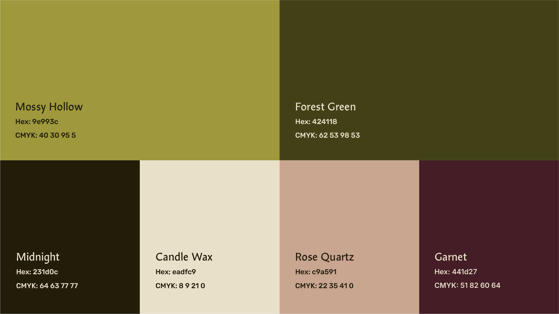
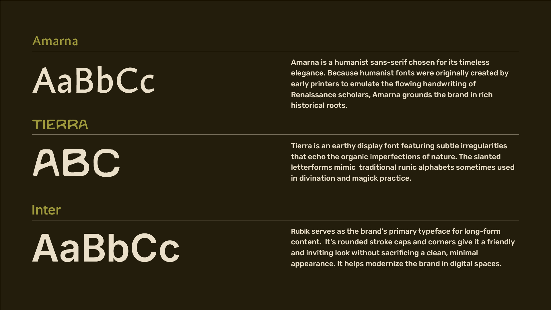
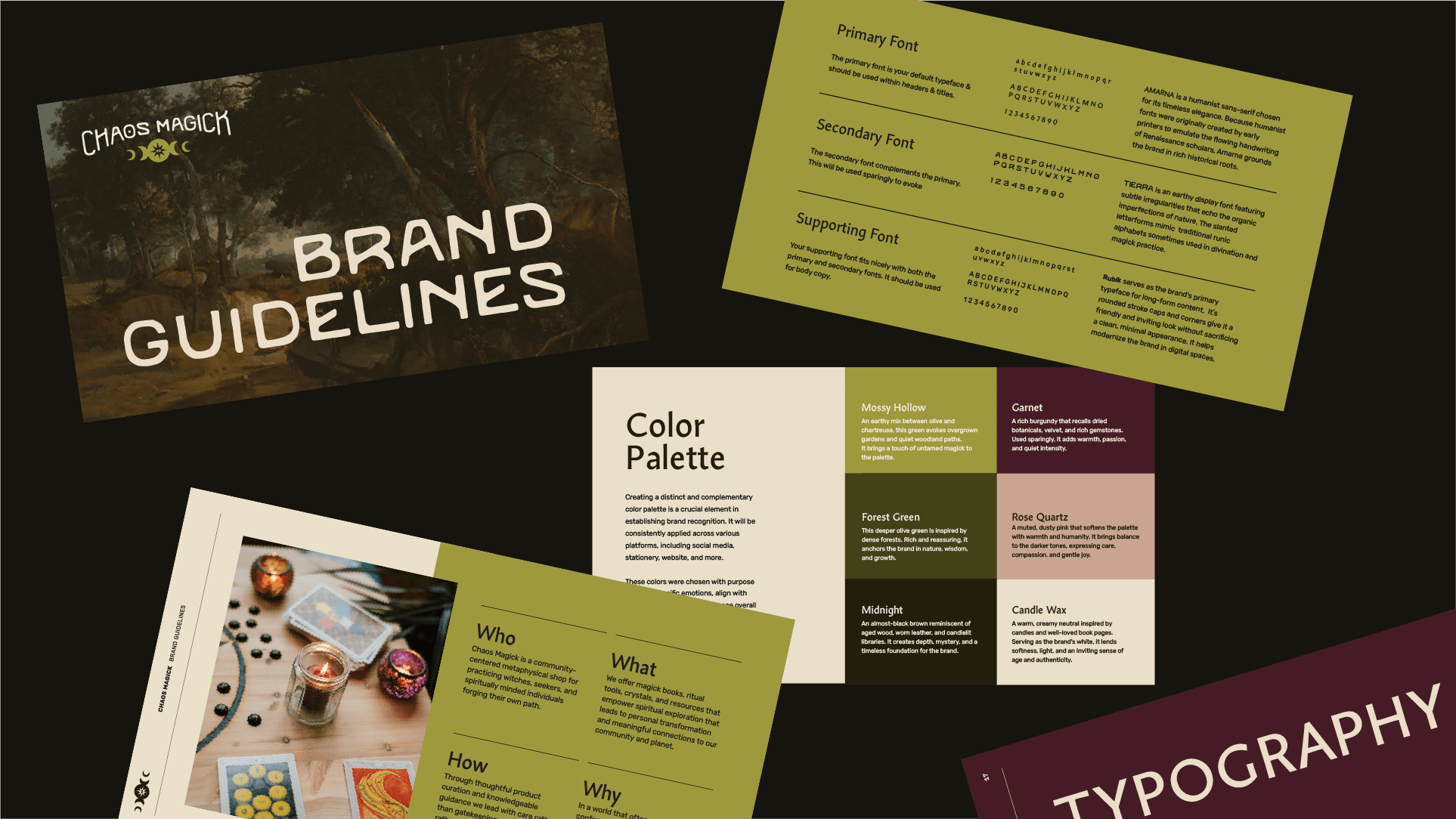
The color palette and typography strike a balance between the mystical and the modern, giving Chaos Magick a look that feels considered, distinctive, and a little unconventional. Together, these elements create a visual foundation that feels rooted in the metaphysical world without leaning too heavily into the familiar aesthetics of the local market.

Brand Patterns & Motifs
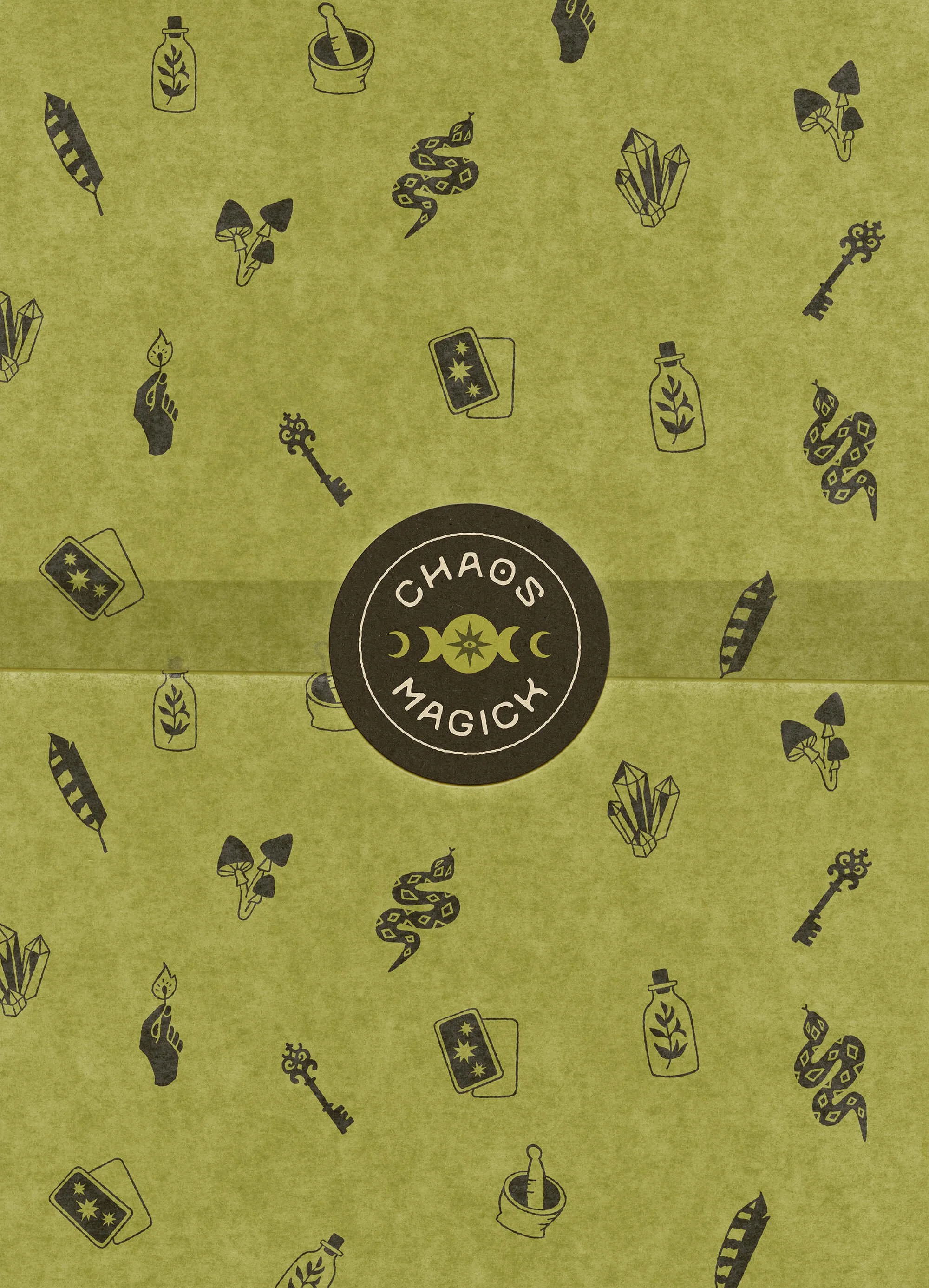
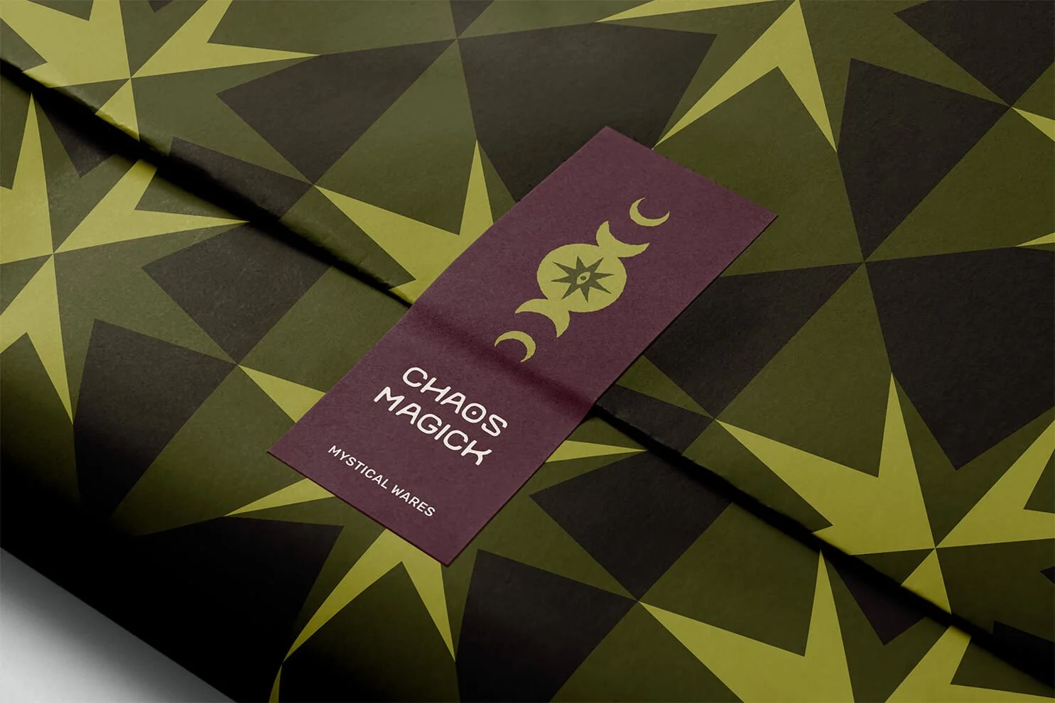
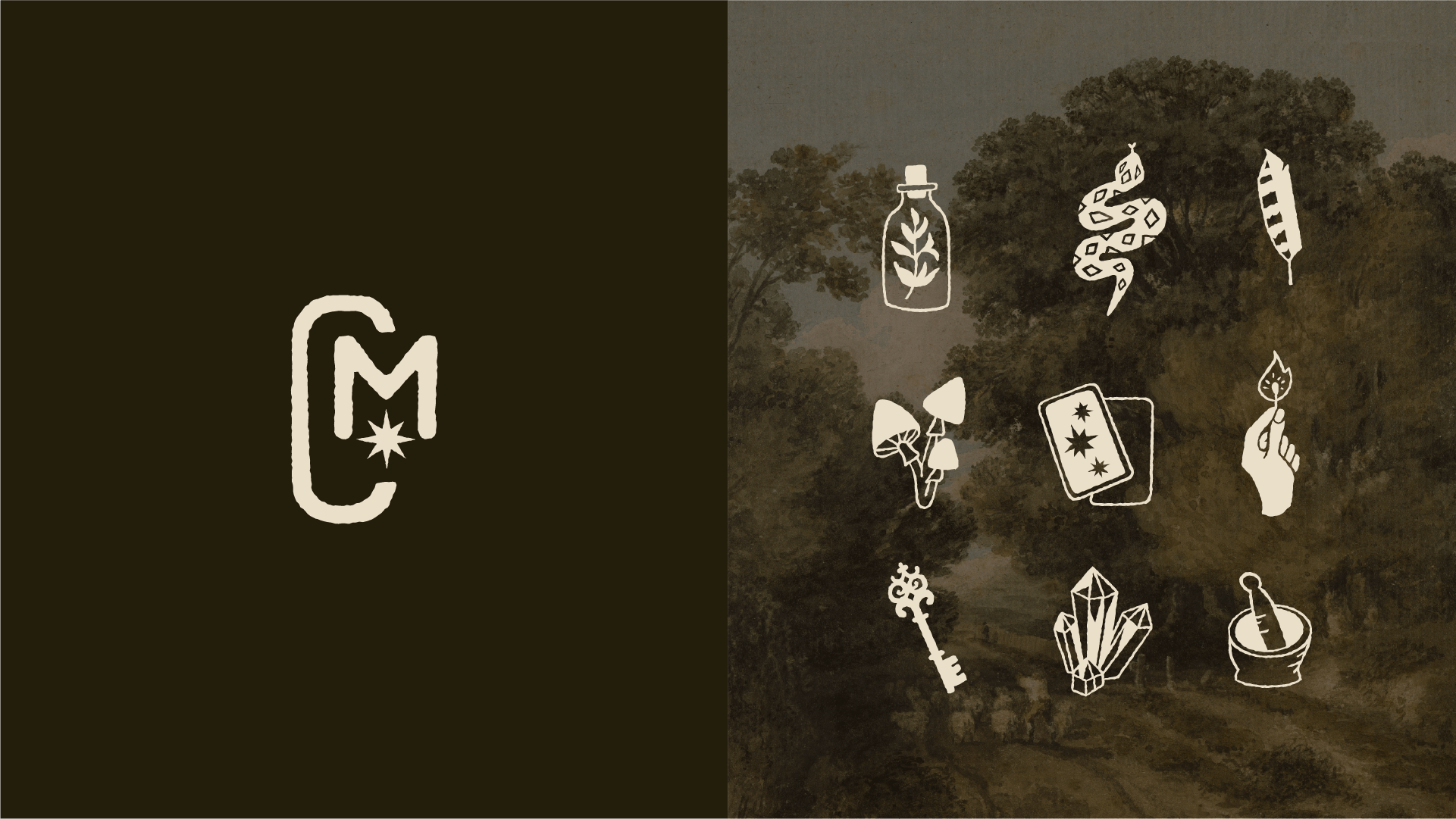
Custom iconography, patterns, and motifs bring the personality of Chaos Magick to life. With a collection of distinctive, witchy-inspired icons, these elements create a visual language that feels uniquely its own. Designed to work across packaging, merchandise, signage, and other brand touchpoints, they add character and build recognition while giving the identity plenty of room to grow.
“Ultimately Chelsey made the design process stress-free and fun (the most difficult part for me was choosing between the three concepts she’d designed, because I sincerely loved them all). Having a beautiful and cohesive brand identity and assets at my disposal is giving me the momentum I need to build my business’ online presence and move us toward our brick-and-mortar launch. I’m thrilled with the work Chelsey’s done and would happily recommend her to anyone in need of branding or design support. ”