Typography-Driven Brand Identity for a Multi-Talented Content Strategist
Aubrey Byron
Client
Aubrey Byron
Industry
Marketing & Content
Services
Logo design
Branding
Iconography
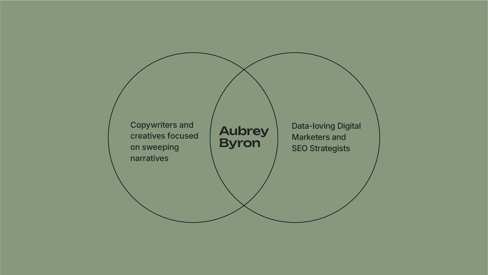
Aubrey Byron is a content marketing strategist who bridges the gap between big-picture strategy and hands-on execution. Combining copywriting, video, and SEO, she helps brands tell cohesive, multi-format stories that resonate with both search engines and real people.
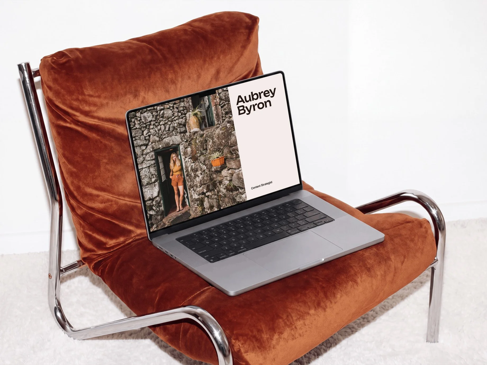
Aubrey came to me looking for a professional brand that could bring her diverse skill set under one cohesive identity. Together, we developed a strategic visual identity that reflects her editorial expertise, builds credibility, and gives her the confidence to show up consistently.
Challenge/Solution
With an impressive mix of skills spanning SEO, copywriting, video production, podcasting, editing, and strategy, Aubrey was ready to take her freelance business to the next level. However, she needed help bringing all those talents together under one cohesive identity that communicated her unique value. Without a strong brand, it was hindering her ability to attract the quality clients she wanted to work with.
Our goal was to build a brand that connected the dots between Aubrey’s journalism and writing background and her broader multimedia expertise. Through strategic positioning and a professional visual identity, we created a cohesive brand that elevated her credibility. It gave her the confidence to show up consistently and helped position her as an expert in her field. Aubrey is now consistently booked by high-paying clients in the cybersecurity space.
Brand Discovery
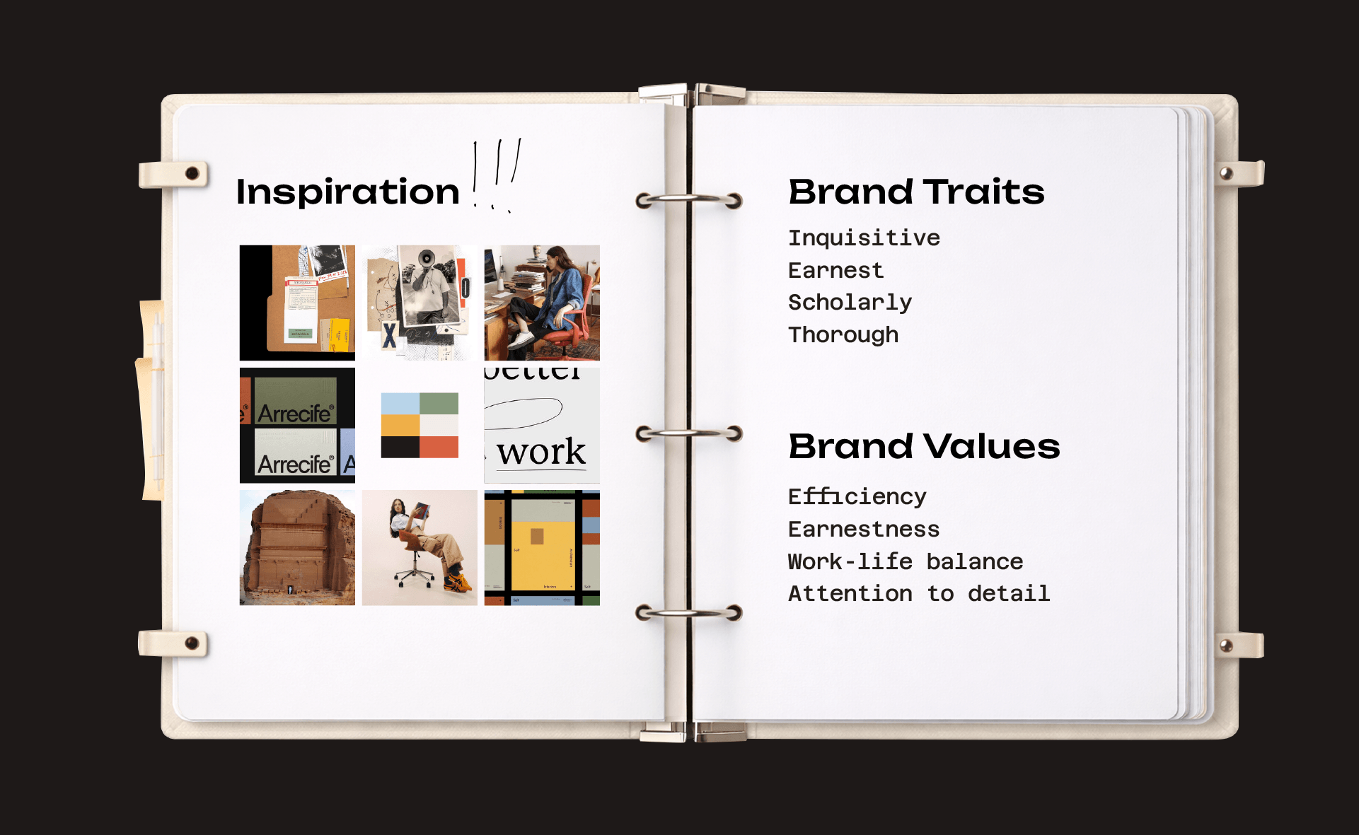
Through a branding workshop and discovery, we uncovered Aubrey’s core values and unique selling proposition: combining journalistic integrity with SEO-driven insights to deliver editorial excellence across every format.
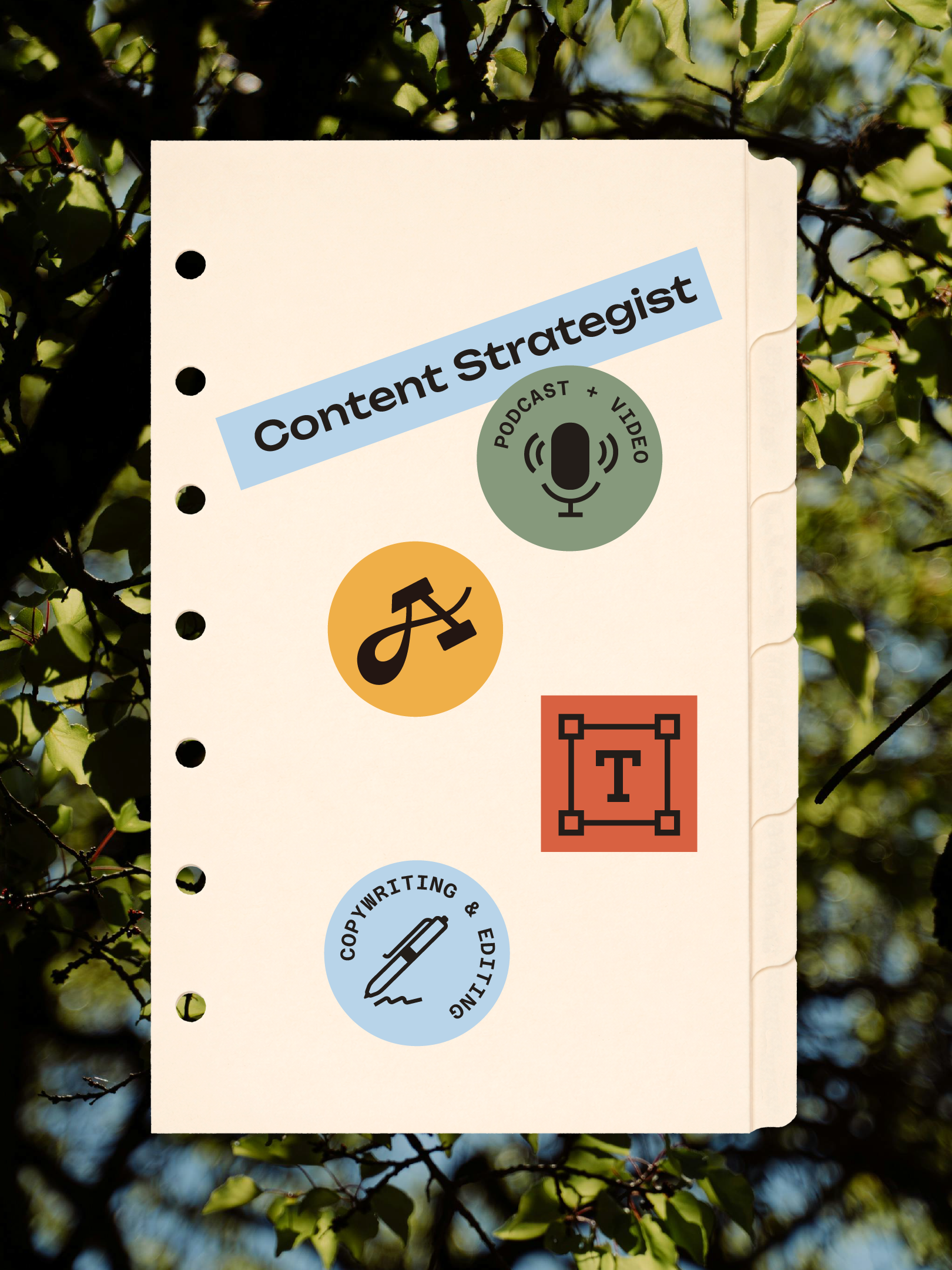
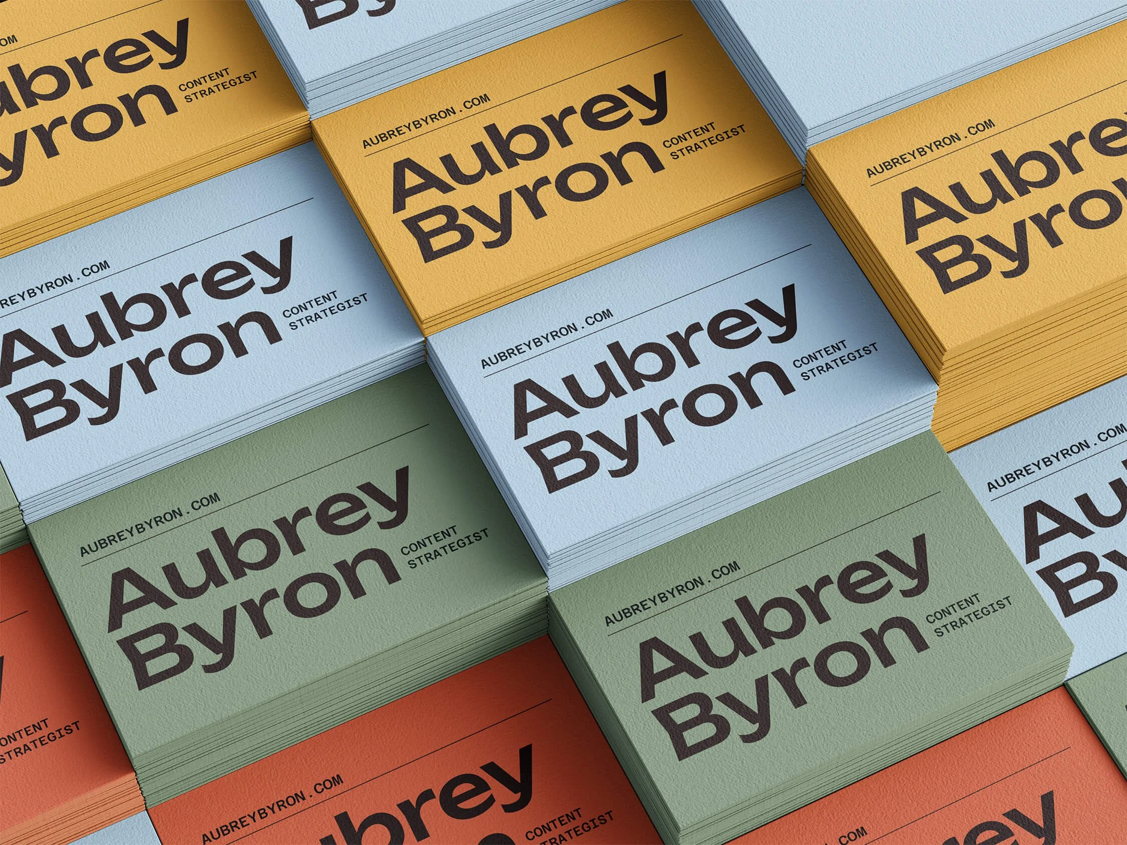
This strategy informed a visual identity inspired by investigative journalism and the pursuit of a good story. Clean typography, earthy tones, paper textures, and office-inspired details bring a scholarly, research-driven feel to the brand.
Logo Concepts
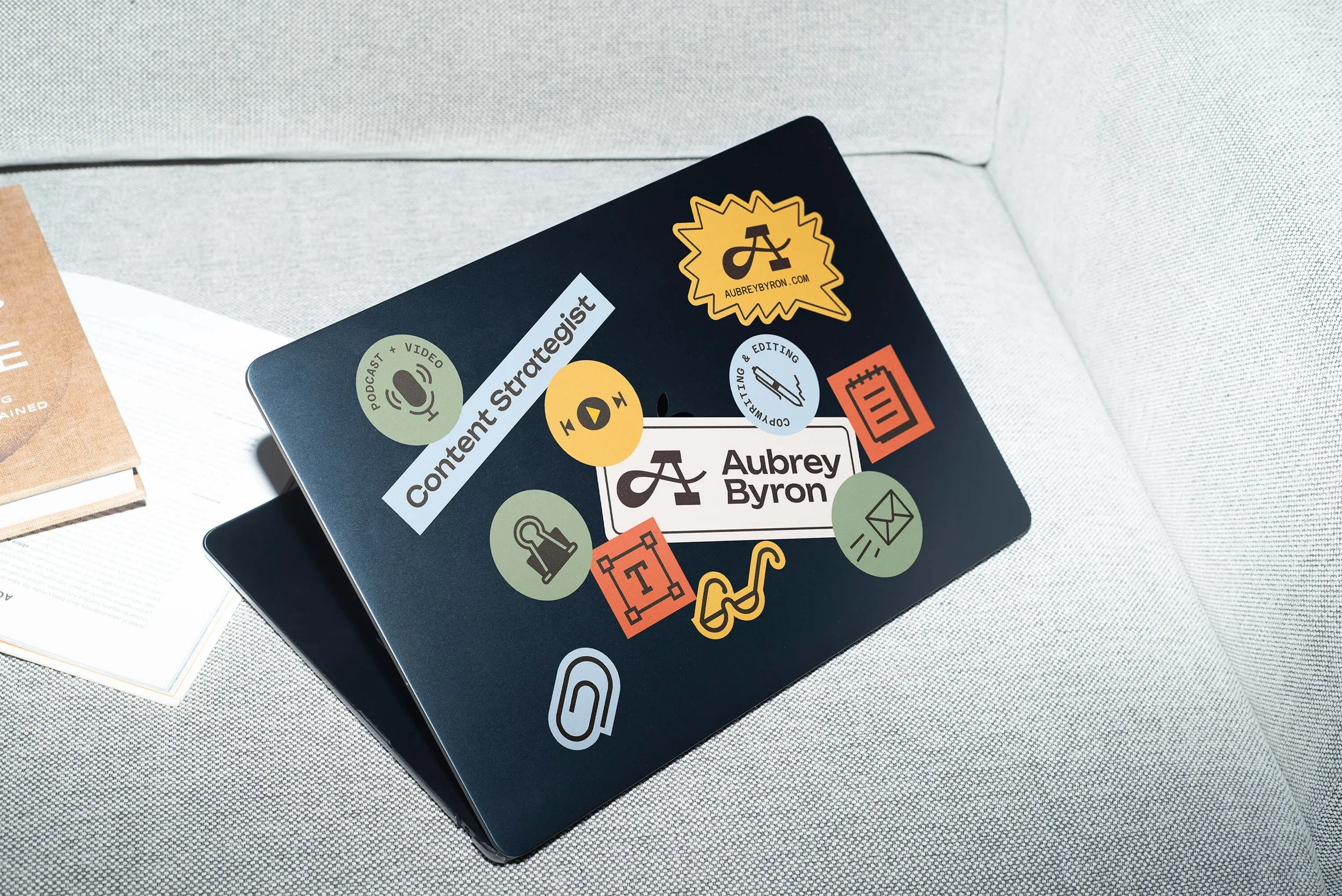
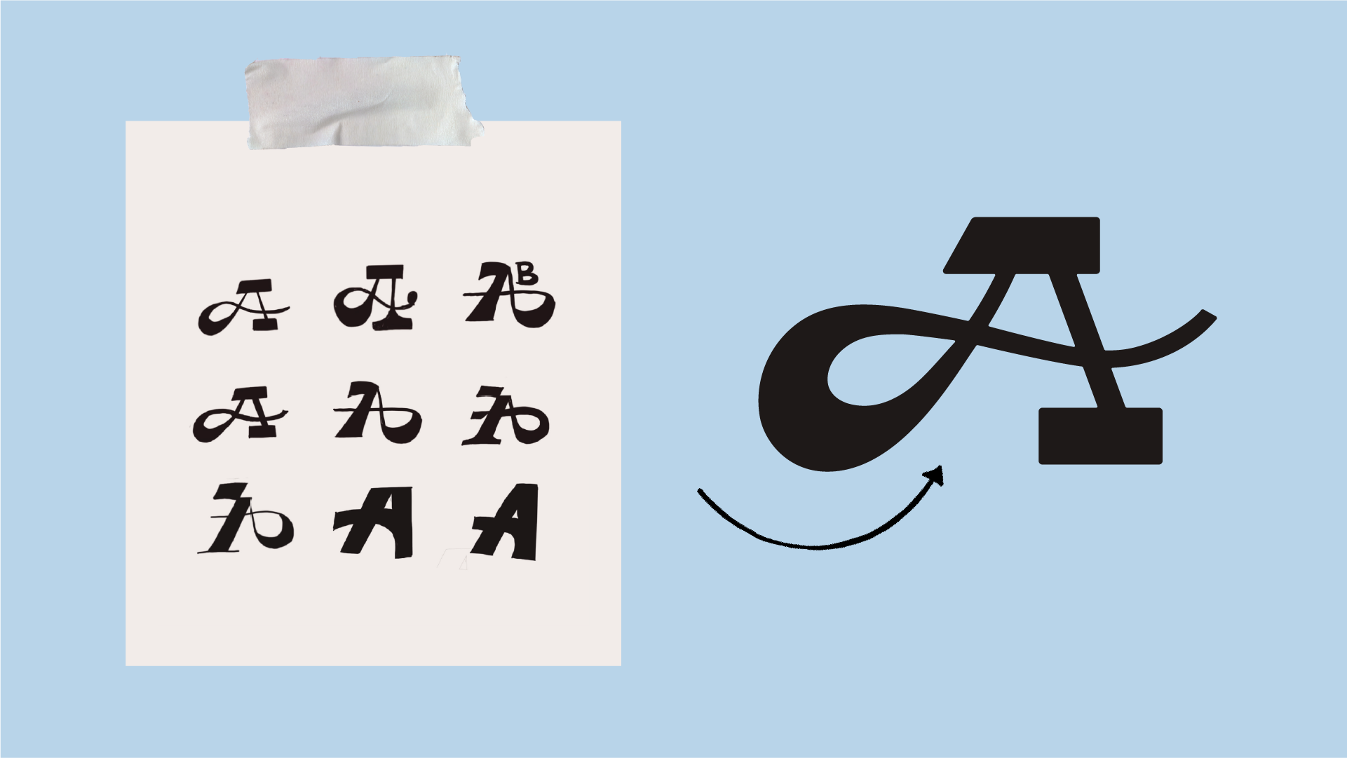
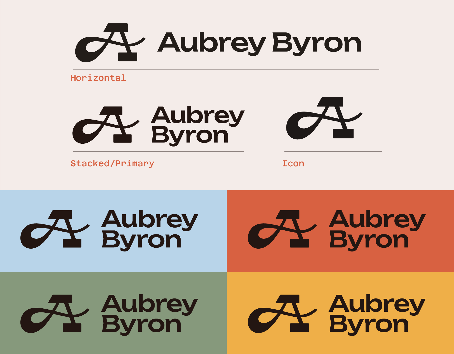
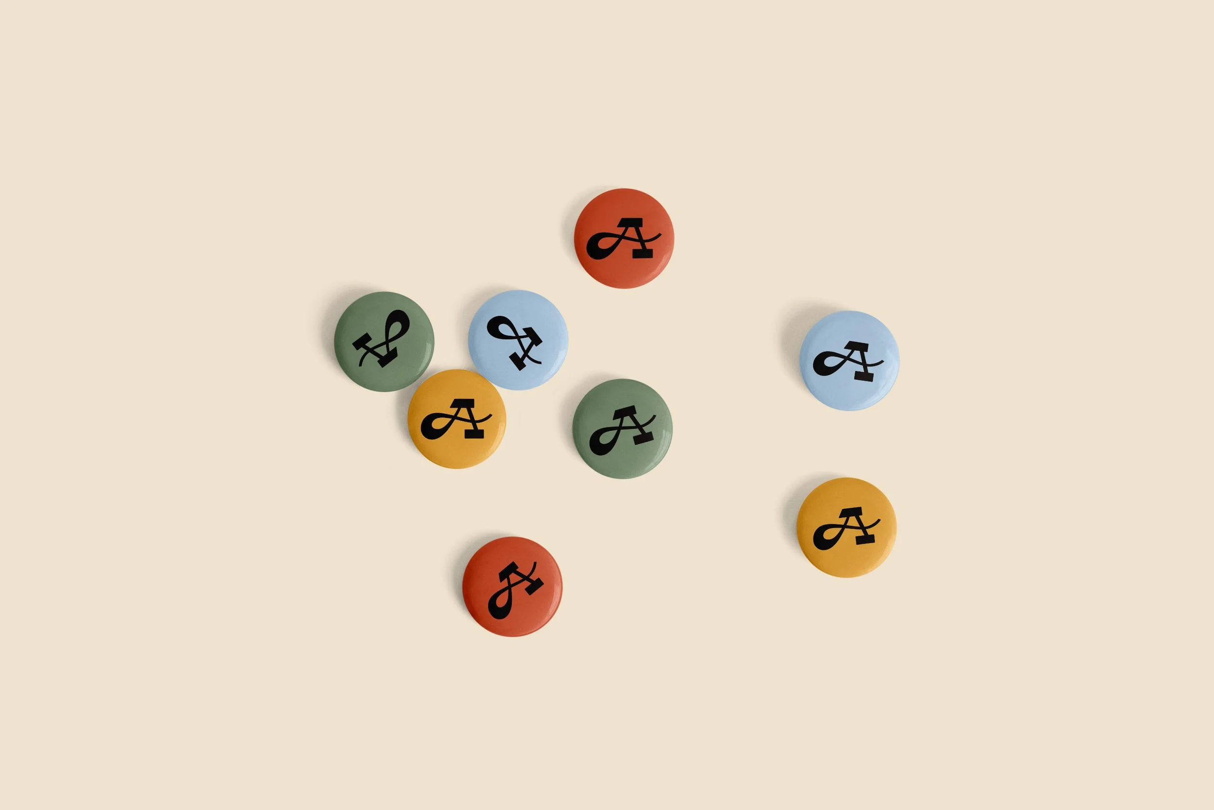
Inspired by the unifying thread in Aubrey’s work, narrative building, the logo system puts typography at the forefront. A custom-lettered glyph blends script and slab serif elements, reflecting the balance between her storytelling skills and technical execution across mediums.

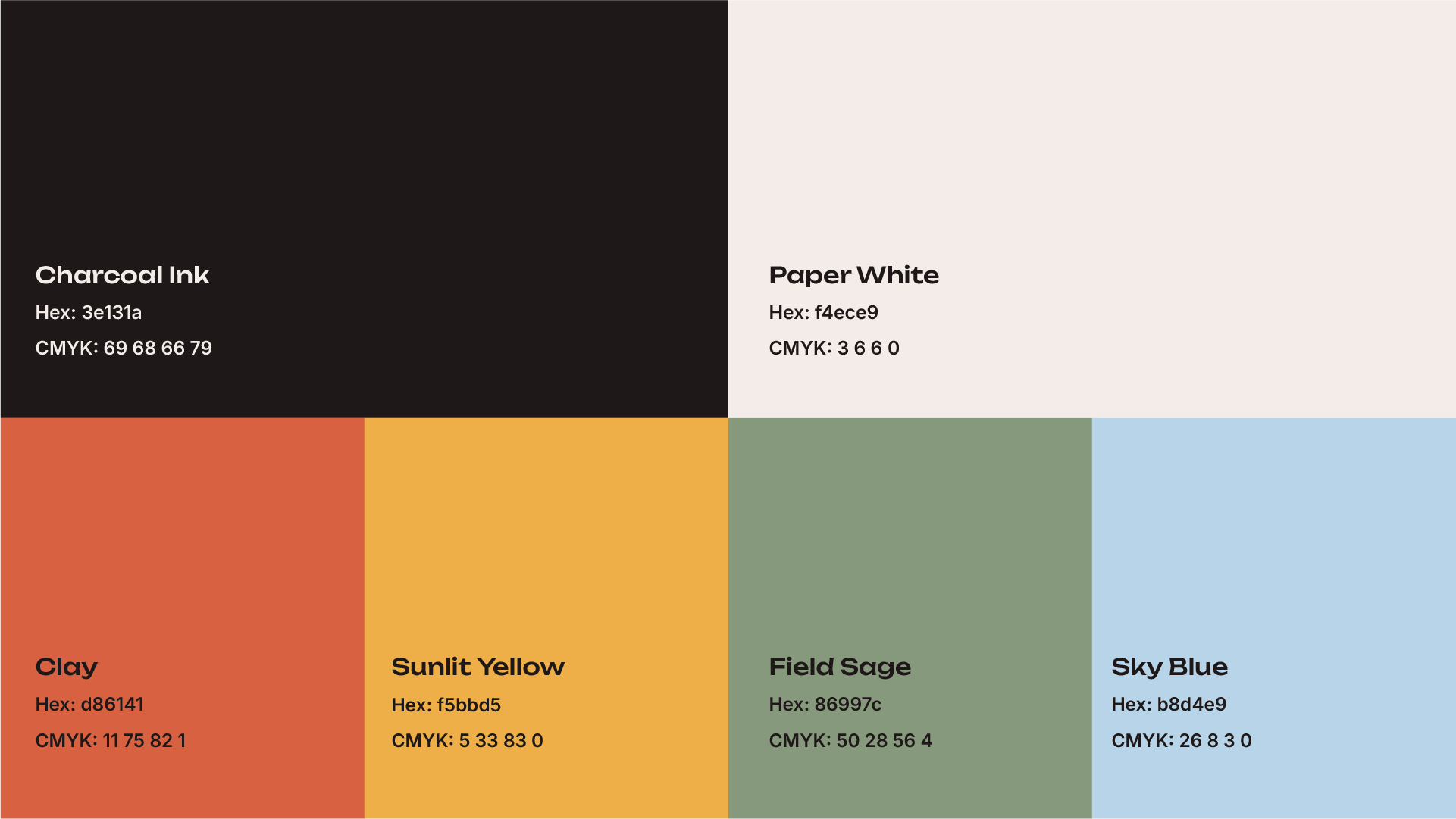
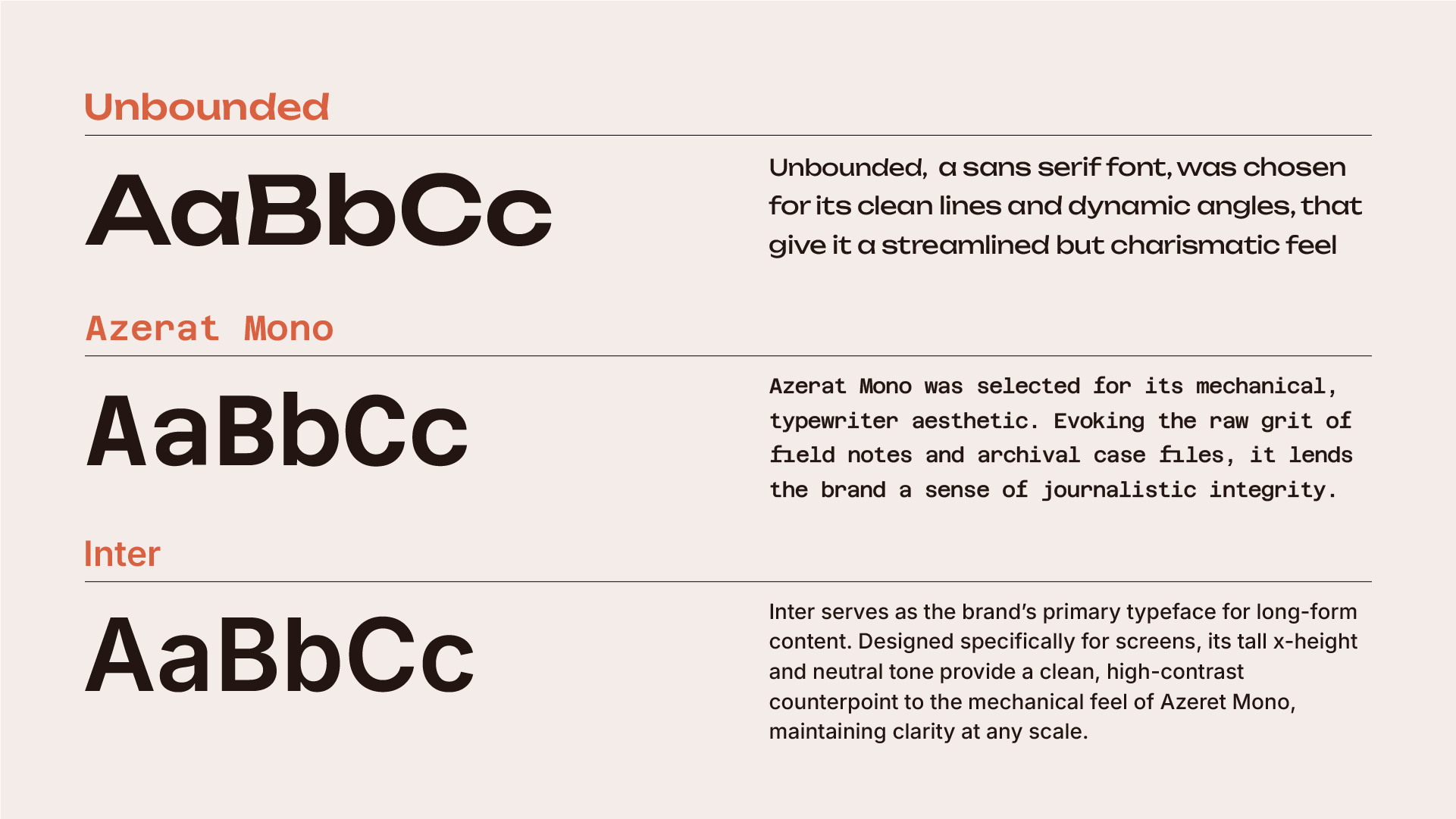
Brand color palette & typography
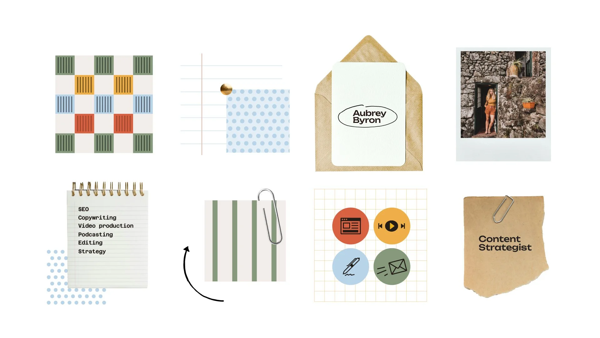
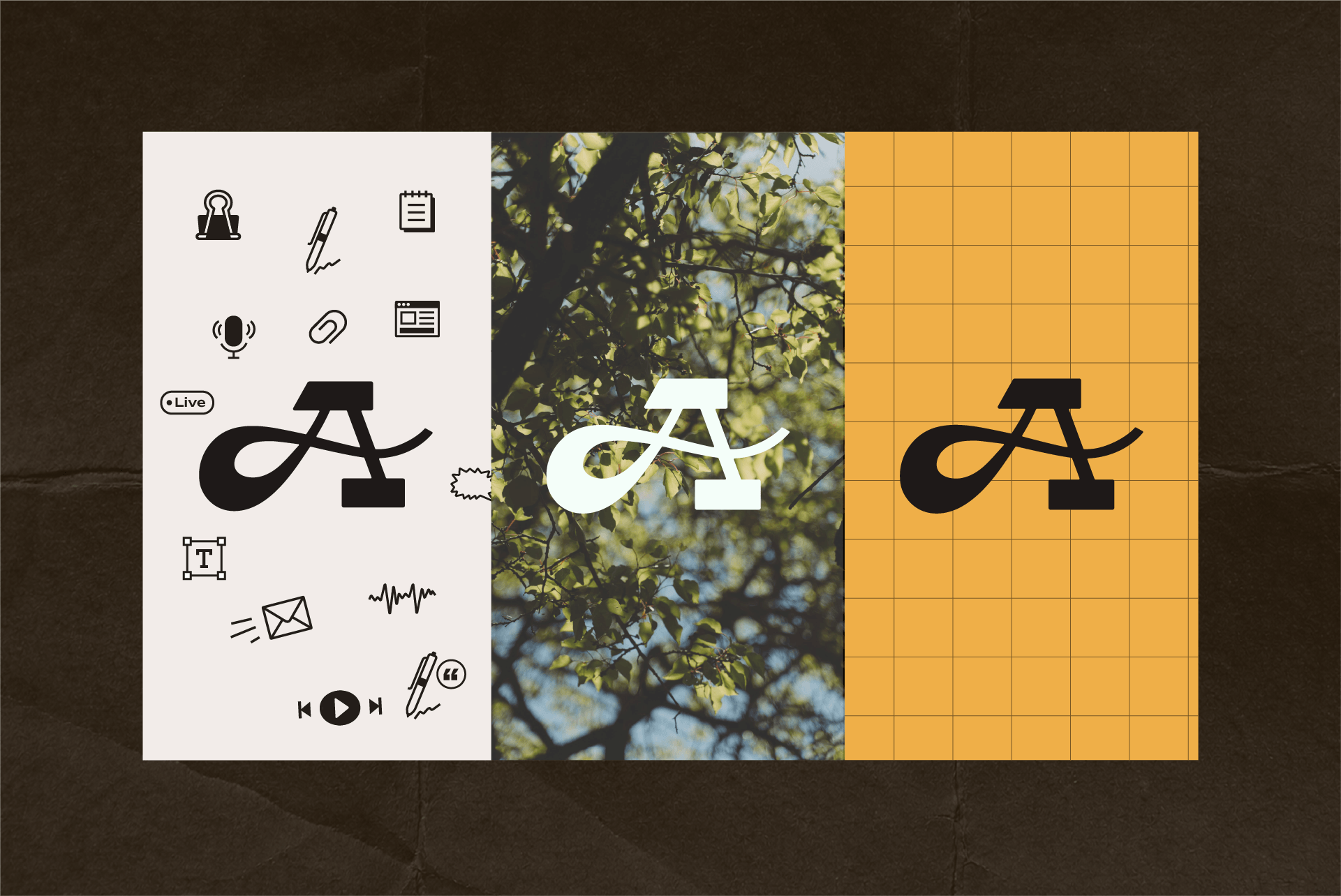
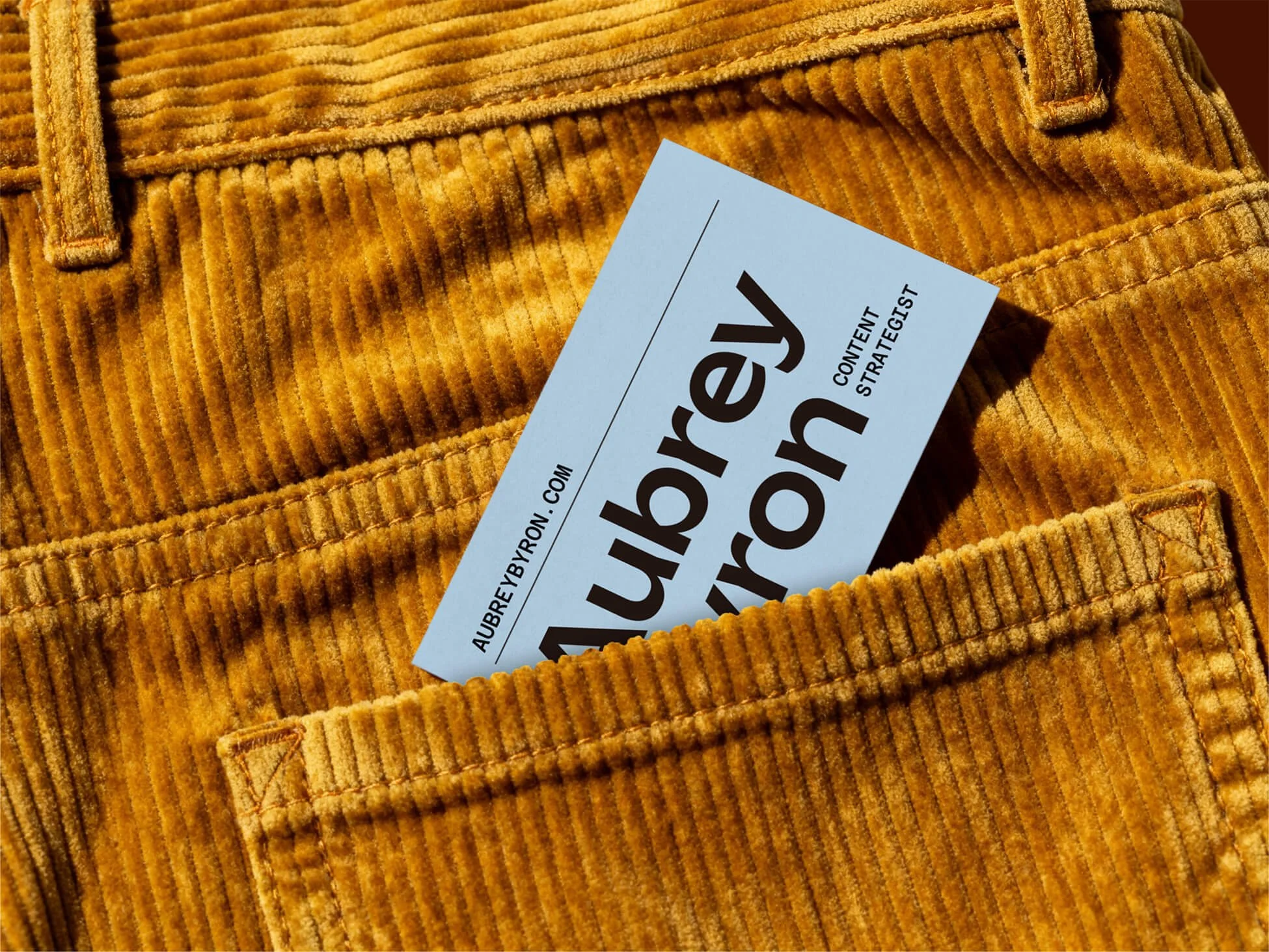
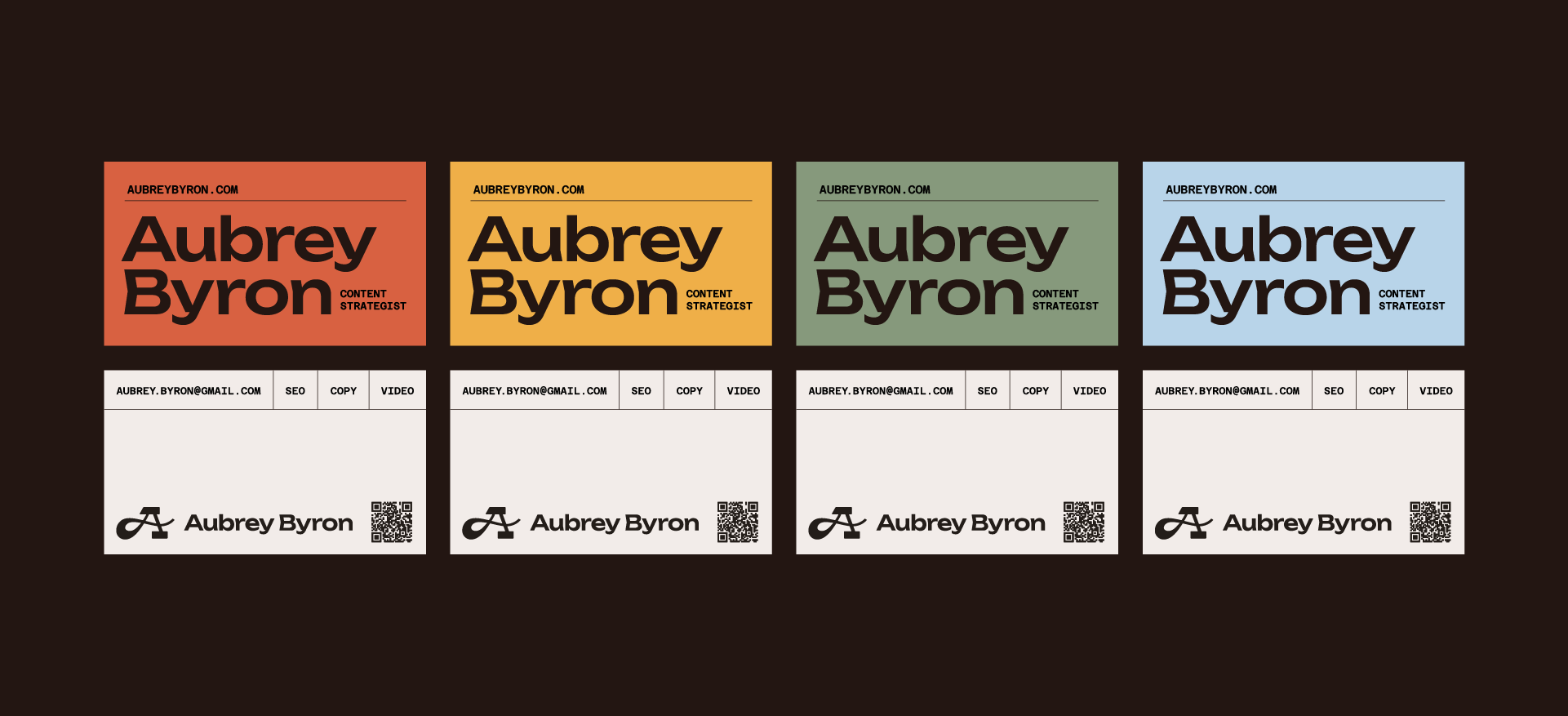
The earthy color palette and tactile textures bring a thoughtful, editorial feel to Aubrey’s brand, drawing inspiration from printed publications, research materials, and the process of uncovering a story. Paired with clean, considered typography, the visual identity feels grounded, intelligent, and approachable, reflecting Aubrey’s research-driven approach to content strategy.
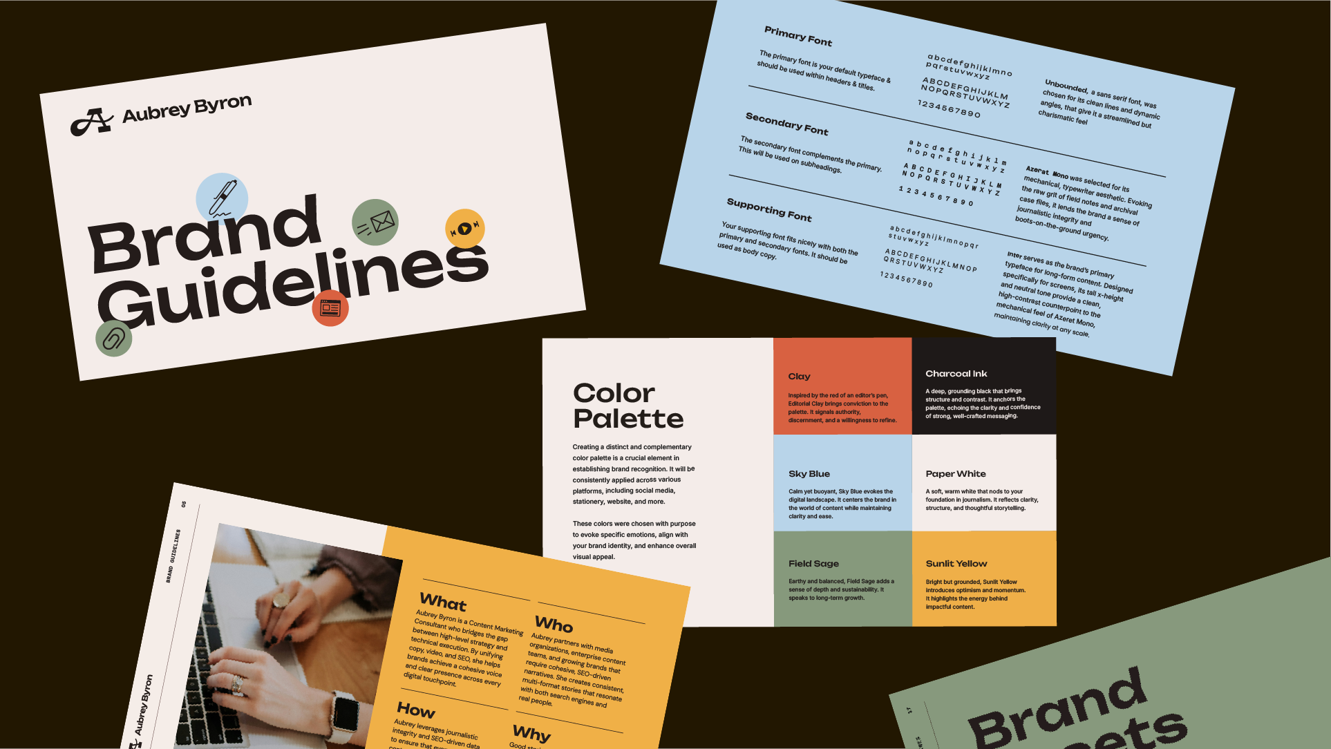
Brand Patterns & Motifs
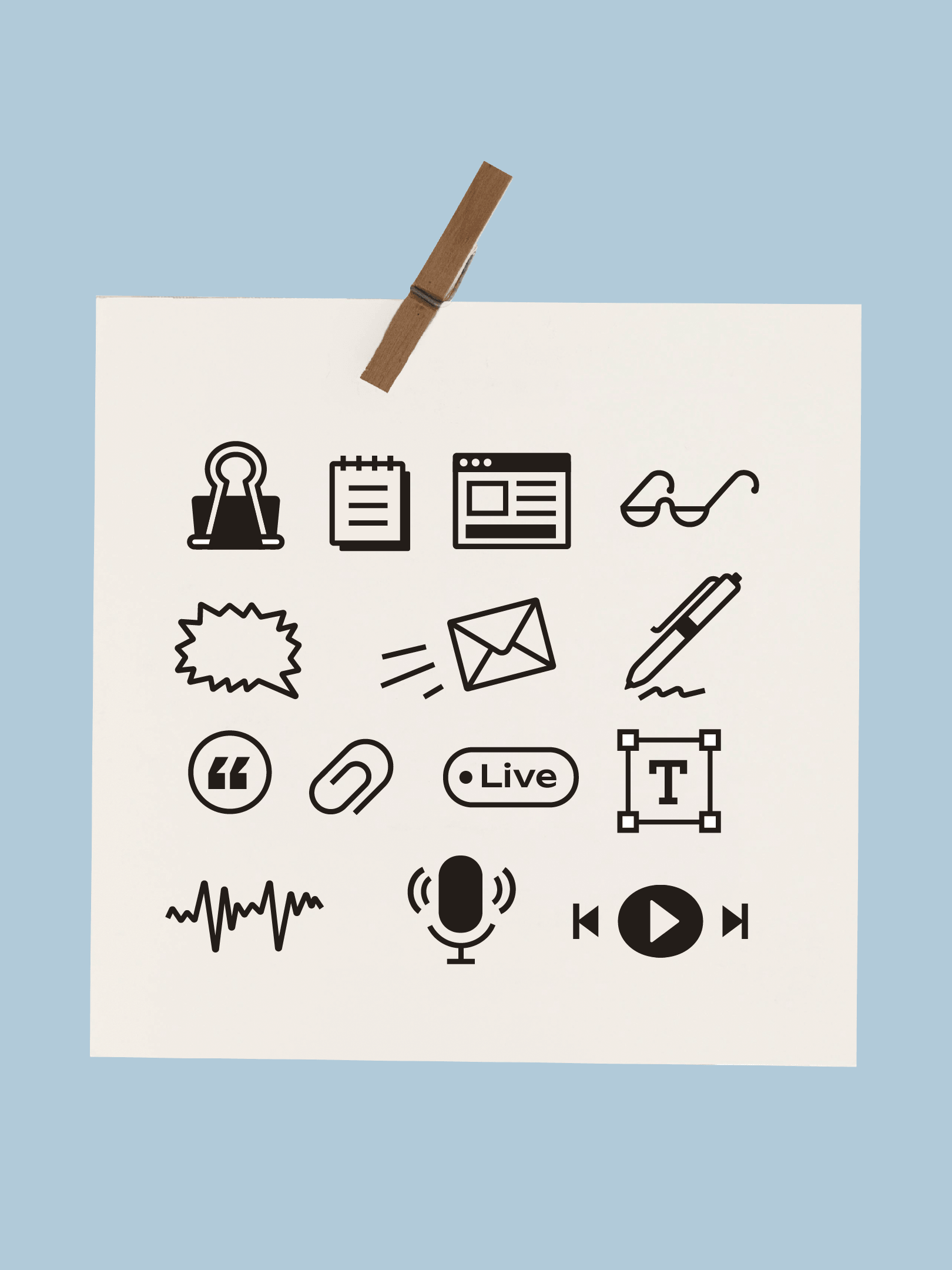
Inspired by the physical tools of storytelling, brand patterns, icons, and motifs incorporate paper textures, handwritten notes, office supplies, and printed stationery. These elements extend the visual identity across touchpoints, building brand recognition and reinforcing Aubrey’s editorial, research-driven approach.