
A Playful Tribute to the Region’s Best
St. Louis Magazine
Client
St. Louis Magazine
Industry
Publishing
Services
Creative Direction
Illustration
Layout Design
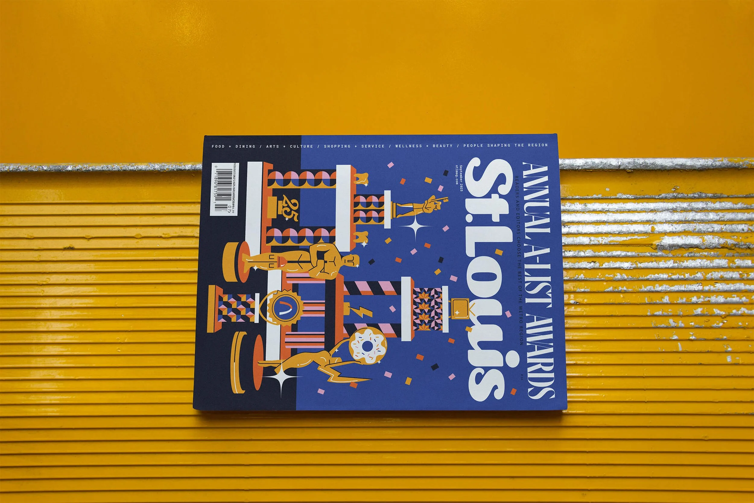
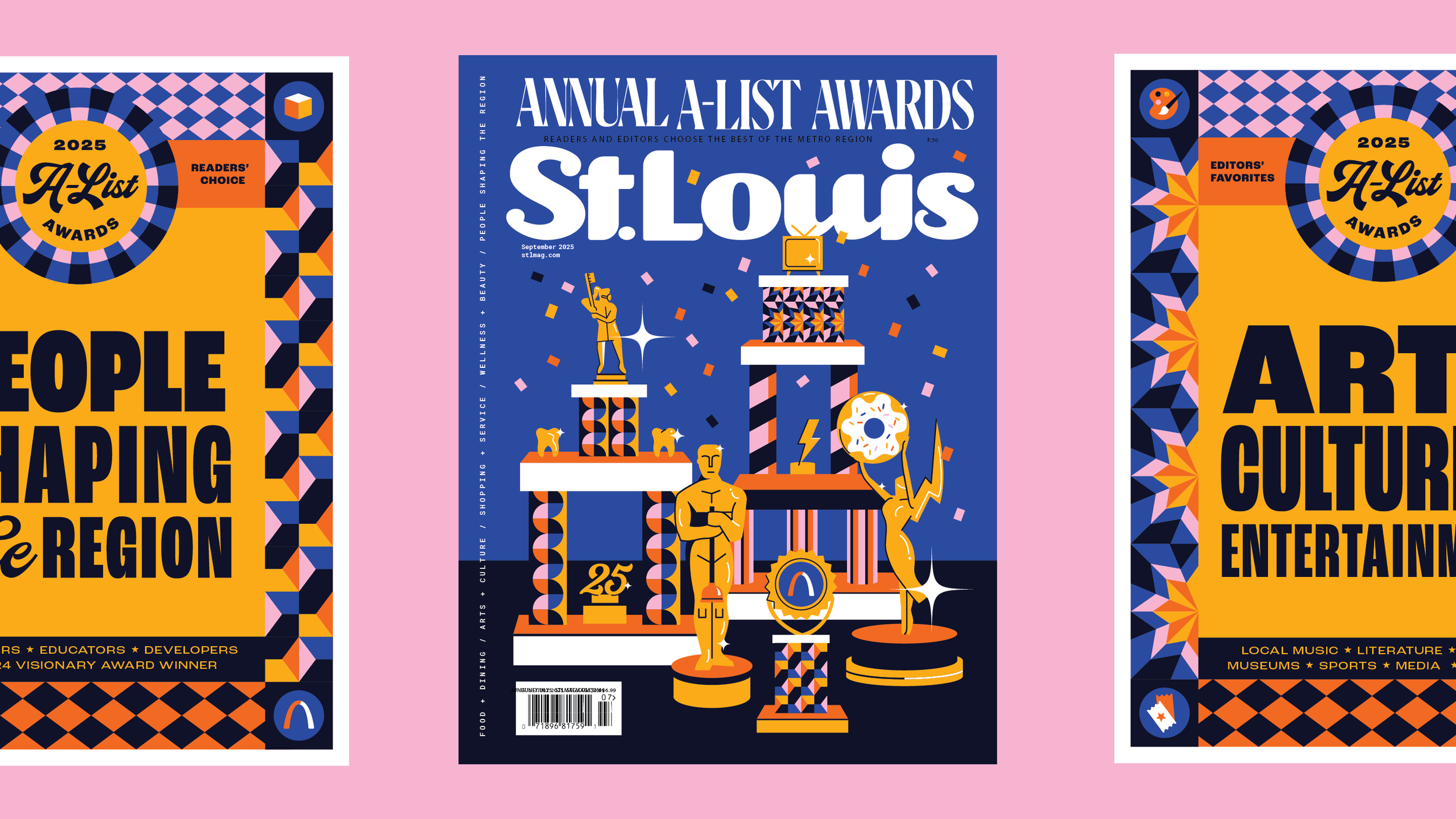
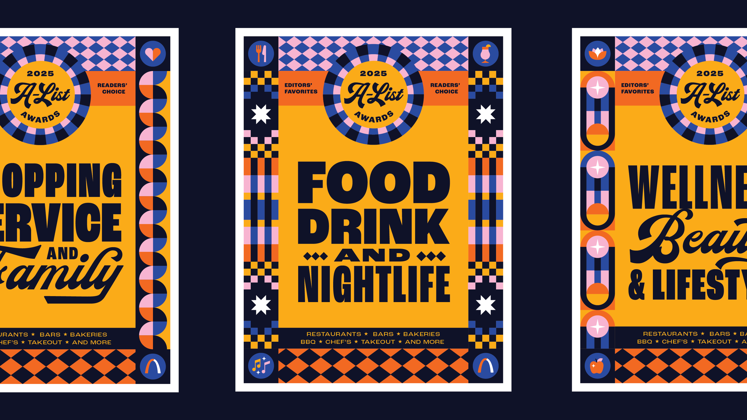
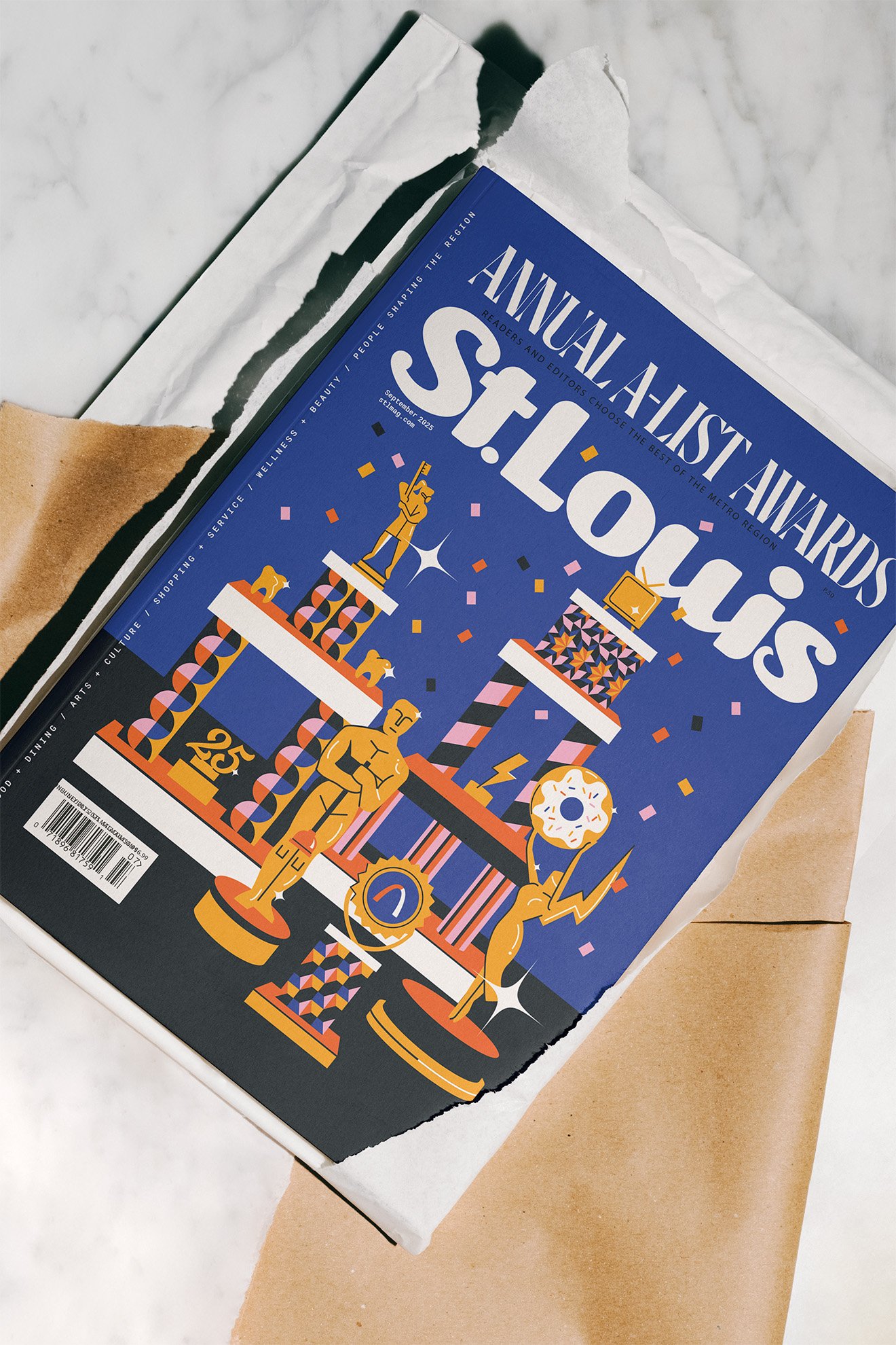
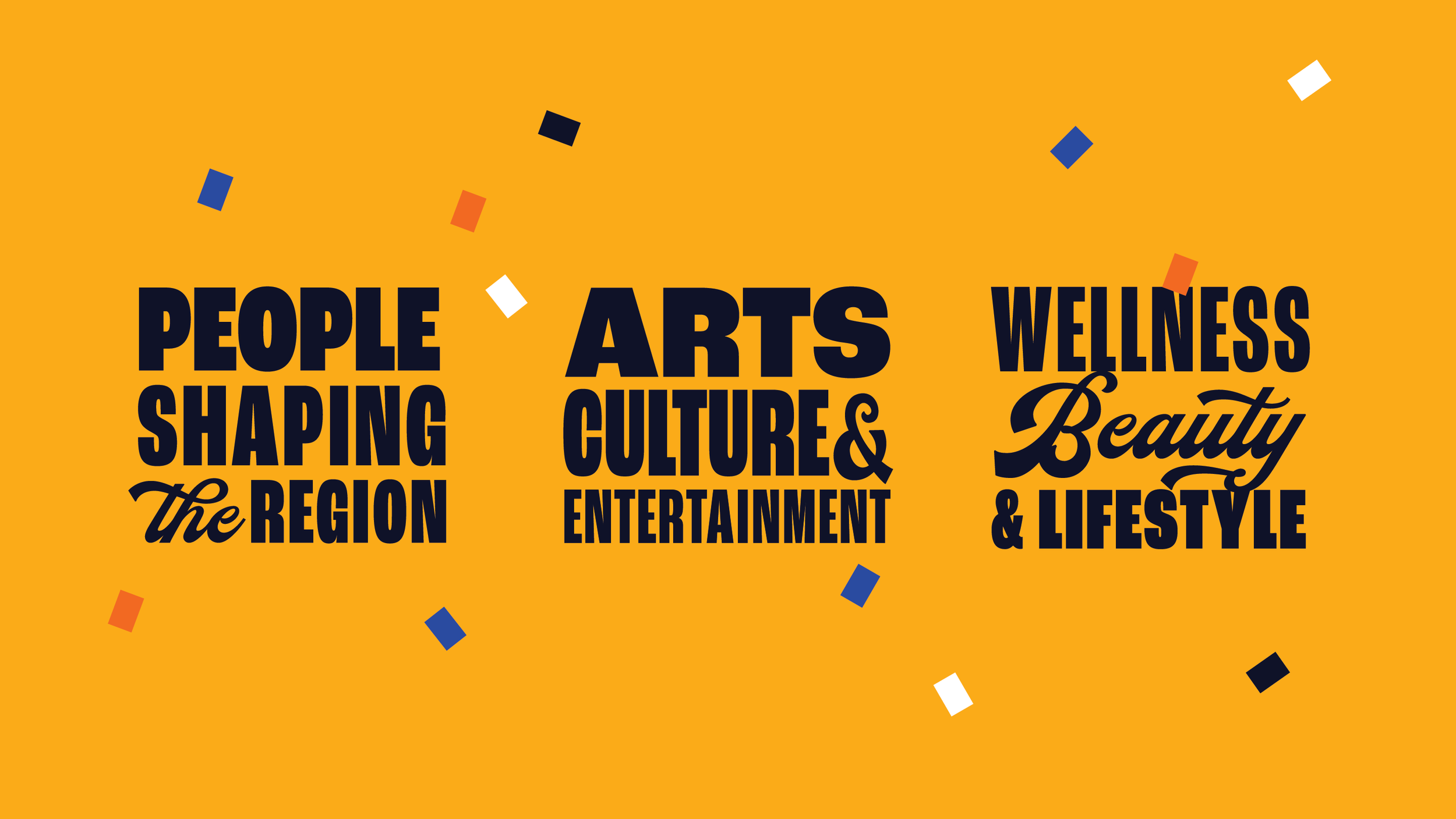
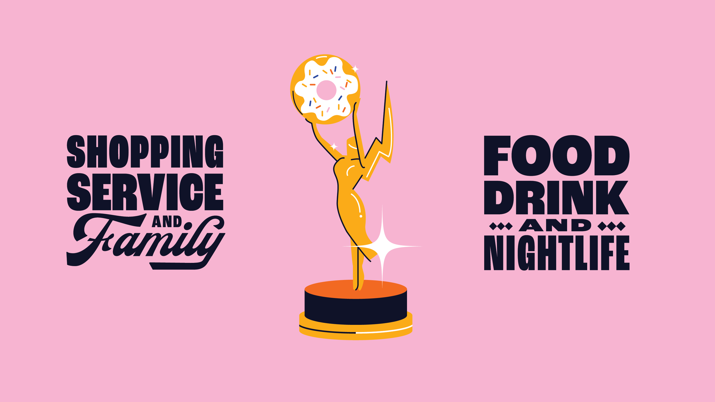
Each year, St. Louis Magazine celebrates the region’s best—from dining and culture to shopping, sports, wellness, and beyond—through its Annual A-List issue. For this edition, I was tasked with designing the cover and five full-page openers that honor the winners chosen by readers and editors.
My goal was to create a look that felt celebratory, distinctly St. Louis, and fresh for this year’s honorees. I pitched the creative direction and carried it through illustration, typography, and graphic design.
The final design draws inspiration from the nostalgic charm of 90s participation trophies, blending bold patterns with playful, award-inspired illustrations to create a lively tribute to the city’s standout people, places, and experiences.


Creative Direction
Within the prestigious A-list Awards, the first awards that come to mind are the “sexy” ones like New Restaurant or Radio Personality. But as explored the full list, I was charmed by the understated recognitions like A-list Plumber, number one Mortgage Servicer, and even best Eye Lashes. The sheer breadth made me smile. I imagined over-the-top, Oscar-style acceptance speeches and chuckled at how wildly different their worlds might be. The A-List Dietician is having drastically different conversations in their day than the slingers of the A-List Burger.
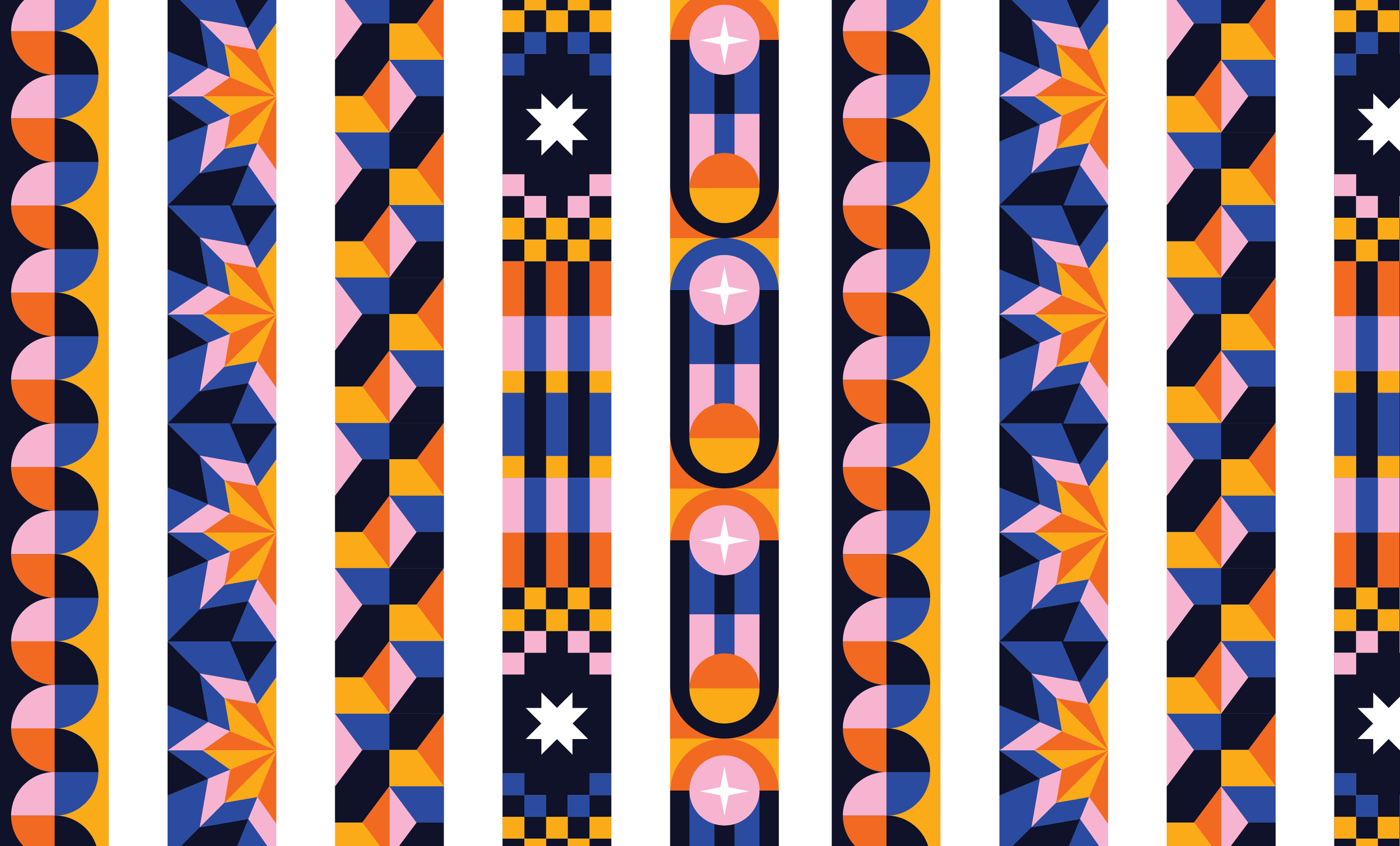
I wanted to capture that humor and celebratory spirit, which led me to the beautifully gaudy participation trophies of the 90s. With their loud patterns, sparkling details, stacked tiers, and amorphous figurines, they strike the perfect balance of funny, charming, and inclusive. This inspiration not only shaped the cover but also allowed us to carry playful patterns into the interior spreads—tying the whole issue together in a way that felt both lighthearted and distinctly A-List.

Moodboard presented to the creative team at St. Louis Magazine
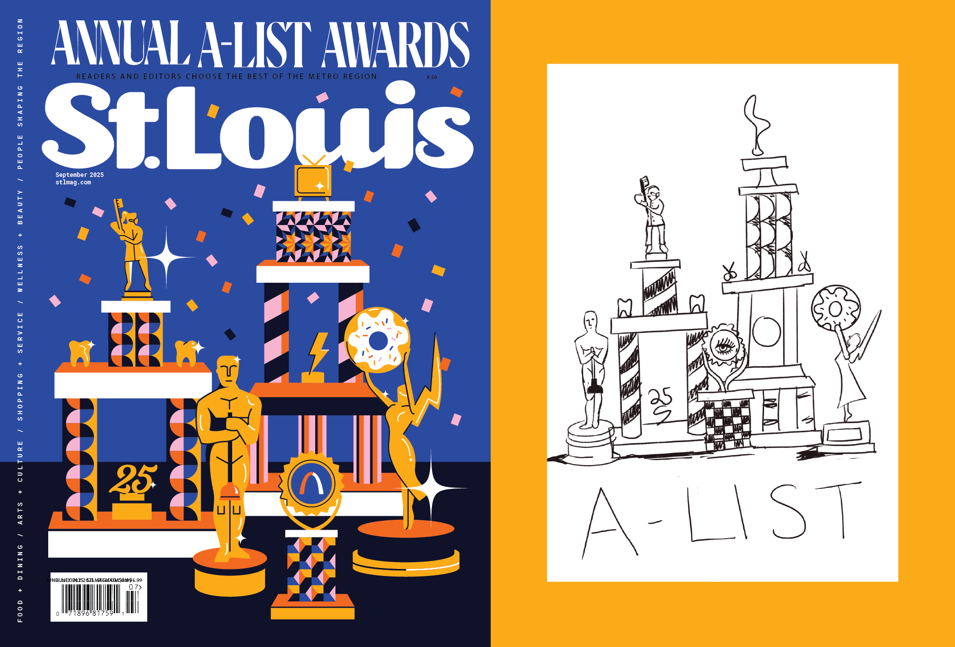
The final cover design next to the original sketch
Up Close
Explore the supporting elements that shaped the final look and feel, including typography treatments, pattern design, and iconography.

Thanks for viewing!
Need bold, playful illustration for your next editorial feature? I’d love to collaborate.